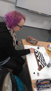
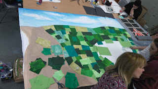
In class, we were asked to draw one of our classmates and create a large wall mural. We started working in pairs, drawing the other person on acetate. We then projected the image from a4 onto an a3 size piece of paper. We used our own style to colour or paint each figure then cut them out. I used pastels and pencils for mine as I was hoping to use shading and a wide colours to produce a realistic effect. We worked very well as a team as we decided on what background we were going to do. We thought about composition when placing the people on the background, as some were smaller than others. We all took part to do our own thing and each added a handprint for the tree. I helped collect leaves for the tree and was to decorate the sky, for this I used 3 shades of blue and used white to emphasise the rays of the sun and the clouds. I also documented everything we done along the way and this is what we came up with...
Thursday, 29 October 2015
Friday, 23 October 2015
Gavin Wood
Gavin Wood is an Art student, he is in his final year at Edinburgh university. His first lot of work was inspired by horror movies, he would create pictures to show the split second before anything happens. His work has no real meaning behind it, he just wanted people to spend time with his art and admiring it for what it is. Gavin was then inspired by Andy Warhol's Do it yourself, 1962. It made him think about how "lazy " our brains are and how we make up alot of information without really seeing what is infront of us. He found interest in how colour is perceived, Gerhard Richter's colour panel was the idea behind his next journey. At the moment Gavin is working in the studio experiment with colours and different patterns to produce his art. His work was completely different from what I have seen before but I liked it, it was fresh and new. I wonder where his art will go next.
Tuesday, 20 October 2015
Raoul Haussman
At college we were asked to look at the Dada movement. We then chose a collage and were asked to replicate it and make it our own. I chose, "A Bourgeois precision brain" 1920 by Raoul Haussman and added a modern twist while keeping some of the main features. In the original, Raoul had placed a photograph of himself in the collage. In my version, I took Raoul's face and put it on another body. I also replaced the typewritter with a laptop and the phone with a mobile phone. I then used a child with his hands on his head to show the chaotic, modern world we have today to show the comparison of how there is an overload of technology. I think it has worked well. I really enjoyed it this project, I felt inspired.
Sunday, 18 October 2015
Futurism - war
At college we have been looking at Futurism. My first idea was to look at city life so I sketched a city scene. My second idea was to look at speed and machine, for this I took the idea of using a modern racing car to promote speed. I have now looked at war, this was also an important part of Futurism. I started by drawing an outline of a person in a position as if they had been shot. I then traced the image, then repeated it as a mirror image. I added soldiers and a tank and coloured them in with pencils, to finish off I used pastels to highlight the shock waves from the blast. Hopefully this has worked.
Saturday, 17 October 2015
Futurism sketches
These are just quick sketches I have done with futurism in mind. The one with the buildings is about city life and the second one is thinking about speed and movement. They are just rough sketches but all in good practice... One thing I have noticed is, I like using charcoal for the lines used to emphasise speed, I think it works well.
Futurism F1 car, 1St attempt
I have been looking at Futurism this past week and I have found it quite an interesting movement. Although there is alot about war throughout futurism, there was also another side which was used to promote the beauty of modern life, including machine and speed. I took the idea of a racing car to show speed in the style of futurism. I traced an image and projected it onto an A3 page, then repeated the imaged another two times over the original . I used charcoal pencils then erased parts of the two images on the right to add movement to the picture. I think it has worked okay but I would definitely like to try another one.
Cubism - jug
Recently, I have struggled with completing a cubist picture. I do feel that I am improving each time though, so this is my latest attempt. This is a jug I drew, looking at it again, I feel I know what to do to improve again so feeling more positive each time I practice.
Friday, 9 October 2015
David Cass
In class we had a visit from David Cass, he is from Stow, in the Scottish Borders. His main interests are painting and drawing but also widens his range by using photography, film and sculpture in his work. What I found interesting about David, is he uses different wooden materials to work on, such as old coffee drawers, wooden chests, table tops and old doors. He likes to paint sea and landscape paintings. He uses alot of gouache in his work aswell. David has travelled to many different places to find inspiration for his work. One art collection I found incredible was 'tonight rain, tomorrow mud', this was inspired by the great flood in Florence in 1966 when two dams burst and water flooded the city and ruined buildings, streets, houses. I found David's work to be different from what ive seen before but it was very interesting to see a different style of art.


Subscribe to:
Comments (Atom)


