Wednesday, 26 October 2016

William Hogarth - Beer Street and Gin Lane

William Hogarth (1697-1764) was a famous painter and printmaker.  He was born in London,  England and was the son of an unsuccessful writer and schoolmaster from Westmoreland. In 1710 he began engraving his own designs after working as an apprentice at a Goldsmiths. By the late 1720's he started painting portraits using oil paints producing a large variety of successful artwork along the way.
Approximately between 1720 and 1751 in London,  there was a large increase in poverty and overcrowding due to a vast amount of immigration from the countryside. This caused many problems for people, resulting in a rise in drinking gin within the middle and upper classes,  but mainly within the lower class .This became a problem due to the Gin Act of 1736, when the British Government tried to control the production. This then provided Hogarth with the inspiration to create a series of etchings based on what he witnessed at this time. The main feeling behind the his work, was to provide a sense of social disorder,  depression,  difficult living conditions,  crime and danger.  During this time,  people were living in fear for themselves, their homes and businesses. He has portrayed this fantastically through each image.
Beer Street was set in a wealthier part of London,  where an image of St-Martin-in-the-fields church within the print.  Gin Lane focused more on the vision of poverty and desperation, set in the West of Bloomsbury.

Gin Lane 1751

I found this image to be filled with many examples of a desperate society.  The woman letting go of the baby because she is completely out of it,  is just insane. This image is very comical in my opinion,  although it probably shouldn't be. There is so much going on, it produces an insight into how bad things were, it is a clever observation which does not seem to be a reality. 

                        
Beer Street 1751

Although it is serious,  I found this image to be quite humorous in some places, despite the fact these is just chaos erupting throughout,  including people running on the roof top. I found it interesting to see a community which has just stopped caring, and finding the solution to their problems at the bottom of a bottle. 

Tuesday, 25 October 2016

The Bauhaus School of Art

Staatliches Bauhaus is an Art school in Germany which is famous for its art and design work. It was known as the most influential art school of the 20th century. The Bauhaus was founded in 1919 by Walter Gropius and ceased operation in 1933. Even after it closed, the work ethic and techniques used had a huge impact on Europe and America within the design world. The aim of the Bauhaus was to provide a complete work of art. This included developments in art,  graphic design, interior design,  architecture,  Industrial design and typography.
The key faculty including artist's were: Wassily Kandinsky (1902-1981), Joseph Albers (1888-1976), Laszlo Moholy-Nagy (1895-1946), Paul Klee (1879-1940) and Johannes Itten (1888-1967). Architects, Walter Gropius (1883-1969) and Ludwig Mies van der Rohe (1886-1969) and Designer Marcel Breuer (1866-1944). The school existed in three German cities, Weimar from 1919-1925, Dessaw from 1925-1932 and Berlin from 1932-1933 but unfortunately had to close due to the pressure from the Nazi regime giving the impression of it being communist intellectualism.
The Bauhaus was shaped by the Arts and Crafts movement and proved to be incredibly influential to the teaching of the arts.  This has now led to the teaching of "visual arts" which was once known as "fine art", and has also gave the education of art a sense of importance.
Although there were many talented Artists, designers and architect's who have influenced many within the field of art,  I found the work of Marcel Breuer quite interesting.  Breuer  was a Hungarian -American Designer, Sculptor and Architect and referred to as one of the pioneers of abstract modern art. He was also best known for his "iconic chairs". The Wassily chair, also known as model B3, designed in 1925, is still recreated and sold in this modern day. What I like most about the sleek,  simple design is how the idea came from the shape of a bicycle wheel. Breuer was interested in three-dimensional design which he made his main focus throughout his career.  He was also inspired by the constructivist theories of the De Stjil movement.


An Artist which I admire is, Laszlo Moholy-Nagy, a Hungarian painter and photographer who also taught as a professor at the Bauhaus School.  His work is highly influenced by constructivism with an interest in integration of technology. He was also known as, "arguably one of the greatest influences on post-war art education in USA. In 1930 he worked alongside engineer Istvan Sebok and technician Otto Ball to release the" Light prop for an electric stage, ( light space modular 1930).

Previous to this,  he created an abstract piece,  titled the"untitled construction"  which was created in 1922. I like how the use of line and simple colour choice stands out against the dark background.


 I was also drawn to the photo montage,  "double portrait" 1923. I like the smooth lines and black and white tone. This was done during the Dada period which I found interesting that this movement was an influence in his work.

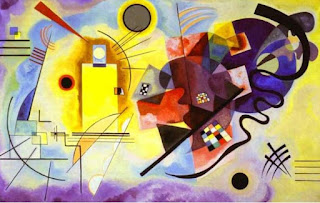
Wassily Wassilyevich Kandinsky (1902-1981) is  a Russian painter and Art theorist, another Artist whose work I admire.  Colour theory played a large part within his work, my favourite artwork is, yellow-red-blue 1925. Kandinsky has used oil on canvas to produce a beautiful array of bright colours.  He has used primary colours for the main body of this abstract art,  with straight and curved black lines which which surround and overlap the shapes. The black is great at bringing the image to life and it is a beautiful piece to focus on.

 "several circles 1926"  is another inspiring piece, with use of  a variety of circles,  different sizes and colours to represent his lifelong search for the perfect form to represent his spiritual expression.

 I also found " Composition v111 (1923)" inspiring. This painting was done while Kandinsky taught at the Bauhaus.  This was said to be, "an expression of Kandinsky's clarified ideas about modern, non objective art." He creates this feeling through his use of colours,  line and dynamic balance.

Monday, 24 October 2016

Artist Presentation - Kevin Greenfield photographer

Kevin Greenfield is a commercial photographer based in Selkirk,  in the Scottish Borders. He began his career in London,  working as a runner (making tea etc) and eventually progressed as a camera man doing film making. As well as doing film, he also worked part-time in a camera shop to earn more money to buy his equipment.  Kevin liked photography and film making because it gave him the chance to travel. He moved to North Wales and began studying at university, where he managed to get onto a degree course. Throughout his time at University,  he found inspiration from past photographer's such as, Henri Cartier-Bresson and William Eggleston. After university,  he returned to London to work on film and advance on his photography, This then led to him working as a full-time phographer. Kevin travelled around the world with his work but works more locally now that he has a family.
Kevin has a Studio space at, the Haining in Selkirk where he works on his film and photography.  He also does " corporate reportage " where he photographs meetings,  business presentations and advertising for local companies such as Waverly Housing. He has also taken photographs of the Minister at a business opening,  advertising a mountain biking company and kayaking. He also works alongside charities some include:  Scottish cross country race, Rock climbing and the elderly in an care home.
More recently,  Kevin has been doing food and beverage photography, where he works mainly inside his studio avoiding the use of natural light to prevent unnecessary reflections in any glass. Aswell as that,  he also provides images for companies including,  Orwell and Goode,  Linda Lovatt and Hawick Cashmere to promote their stock. In some cases he needs to digitally manipulte some images or combined a few different images to reach the desired effect. He uses 3 main lights while photographing in his studio: the main light for shadow and light, a fill light and a backlight. He has also photographed art works by local Artists including Mary Morrison and John Berry.
Kevin has spent time taking photographs of interiors for advertising and worked at many weddings.  His favourite part about wedding photography is meeting new people,  he describes how working on your own can become quite lonely,  so it is good to take part in weddings.
More recently,  Kevin has been perfecting his work in glass photography for some of his clients.
I found Kevin to be very dedicated to his work with a passion for all that he does. He has a wide range of experience and knowledge about techniques,  styles  and expectations of an image. I was amazed at the quality of the photos he showed us, I would definitely recommend him for any photography work. He also has an email address where he can be contacted -
Www.kevingreenfield.com
Below are some images taken from the website


Thursday, 20 October 2016

Pablo Picasso - The Vollard Suite

Pablo Picasso is best known for his Cubism paintings but he also had an interest in printmaking. Between 1930 and 1937, he produced many etchings which became part of The Vollard Suite. This became the most important series of etchings by one of the most important artist's of the 20th century. In 1930, Picasso was asked to produce a series of etchings by the art dealer and publisher Ambroise Vollard (1866-1939) in exchange for paintings by Pierre - Auguste Renoir and Paul Cezanne. It was Vollard who got Picasso his first exhibition in Paris.
Picasso wanted to create a story where he showed the passion of love and lust while exploring identity and inspiration. He began working on the suite in 1933 and finished in 1937. It was  due to the death of his dealer and publisher Vollard and WW 11 that prevented the sets from being on the art market until 1950s.
Th Vollard Suite is known as a neo-classical masterpiece but does not follow a linear narrative.  Throughout his work, Picasso produces an insight to his 'beast within ', where he identifies a tension between man and beast. He uses a variety of techniques to bring his vision to life. In 1934 Picasso found inspiration from the work of Rembrandt (1606-1669). There are traces of inspiration seen within his work  through the use of light, dark and shadows.
During an exhibition in Madrid in 1971, the suite was targeted by a parliamentary group named the guerrilleros del christo rey (warriers of Christ and the king). They tore up some of the pictures and poured acid over the prints.
While Picasso worked on the suite he began a romantic relationship with Marie-Therese Walter (1909-1977) although still married to his first wife Olga Picasso. Walters was nearly 30 years younger than Picasso but she was a big inspiration and is visible within the suite. In one image, she is portrayed as a model lying in the arms of a bearded sculptor. She also inspired him to produce a series of bronze heads in the neoclassical style.
The suite begins with a theme of the sculptors studio which are not titled but each piece is inscribed with the year, month and day that he drew it. There are also three prints which are portraits of Vollard.
It is thought by some, that the minotaur became an important role in building a visual of Picasso's identity, it also provided a deep psychological importance with the suite.
Along the way, Picasso also learnt new techniques including line etching,  dry point and aquaprinting and sugar aquatinting,  this helped him achieve a larger variety of painting effects.
After learning about the Vollard Suite,  I found it to be an interesting idea. The images are quite strange and alarming to look at. It also made me question what he was thinking.  It does provide an insight into his life at the time he created this.


Tuesday, 18 October 2016

Self portrait influenced by Picasso's blue period

I was asked to do a self portrait in the style of Picasso's blue period for a homework assignment.  I was not aware of Picasso's blue period so I had to research this. As I began to discover the meaning and inspiration behind the work,  I found it to be an interesting and inspiring.  I was also drawn in by the connection Picasso had with his subjects,  which provided insight into his own emotional state.
I discovered that Picasso's blue period began in 1901, lasting 3 years.  Throughout this period,  he used a simple colour palette of mainly blues,  with only occasionally adding another colour. I found out that during this time, Picasso was experiencing difficulties in finding success through his art, as well as not having a fixed studio space. By 1904, Picasso had moved to Paris but its important to say that his work was originally inspired by Spain.  His work also reflected his personal problems at that time, including the death of his friend Carlos Casagemas, who took his own life, by shooting himself in the head on February 17th 1901. This had a great impact on Picasso,  but he used his experience to create his Art. Most of the people in his paintings are what we would call "lowlifes". It was unfortunate,  but most of the people he painted were beggars,  drunks or prostitutes.  I feel that by only using a variety of blues to create his work, he has captured the emotional state of these people,  giving an overall sense of failure to each painting. Picasso managed to capture his subjects feeling low, helpless and defeated, this inspired me for my self portrait. I decided to sit with my head slumped in my hand, this is how I would express my feelings of defeat and sadness.  My eyes are open wide because even at my lowest point, I never close my eyes and shut the world out - I am too strong a person to hide away.  I used only watercolour to create this portrait using various brushes for detail, and a stipling technique for the background so that it didn't take away from the main image.  I enjoyed making this self portrait much more than I thought I would,  probably because I found it interesting that the colour was creating the mood and sense of feeling. I would definitely like to try this again.

Sunday, 16 October 2016

Analytical and Synthetic Cubism

Cubism is an Art movement which began in the early twentieth century, the idea behind it was to provide a new way of representing the world. The main artist's known for their cubist artwork are: Pablo Picasso,  Georges Braque and Juan Gris. The Cubist movement was separated into two phases, the Analytical and the synthetic.
The Analytical stage was the first of the two phases. Which was approximately between 1908-12. The main characteristics of this phase were the use of fragmented shapes, used to provide multiple view points of an item or person. The object was broken down viewpoint by viewpoint to create a broken down shape. This was accompanied by the use of overlapping within the image, through other objects or a figure in front of another.  Another feature of the Analytical phase was the use of a simple colour palette. This purpose this was to create an easier overall view of the painting.  By using a wider range of colours, the focus would not be directed on the main image. Some of the well-known paintings included:
                         Georges Braque,
                    Glass on table 1909-10,
                             oil on canvas.

                         Georges Braque,
                       Mandora 1909-10,
                           oil on canvas

                            Pablo Picasso,
                        Seated Nude 1909-10,
                            oil on canvas.

These works clearly demonstrate a neutral palette with a good structure to create the ideal viewpoint.

The second phase of the Cubism movement was called the Synthetic,  this began later on, around 1912-14. The main difference between the Analytical and synthetic,  was the synthetic phase was more focused on a wider colour range including brighter colours, as well as the use of simpler shapes. The synthetic stage came about when the Artists began using textures and sometimes collage, using patterned paper or even newspaper.  The main idea in this phase was, by taking an object and flattening the shape, it didn't have any signs of a 3 dimensional object. Good examples include:
                           Pablo Picasso,
            Bottle of vieux Marc, glass,  guitar                           and newspaper 1913,
             printed paper and ink on paper

                            Pablo Picasso,
                        Bowl of fruit,  violin
                          and bottle 1914,
                            oil on canvas.

                               Juan Gris,
                       The sunblind 1914,
                  Gouache,  collage,  chalk
                  and charcoal on canvas.

                                Juan Gris,
      Bottle of Rum and Newspaper 1913-14.
                           Oil on canvas

When comparing the Artwork from the Analytical phase against the Synthetic phase there is a variety of differences.  Although Picasso used many shades of blues while Braque used a palette of mostly browns and beige in the Analytical phase. It is clear to see there is a smoothness to the paintings,  even though the shapes are angular.  From the Synthetic phase,  mixed media has been used to give a sense of shape in a 2 dimensional form.
Personally,  I prefer the Analytical phase as I like the use of tone and line to create shapes and objects.  I also like the variety of colour used from such a simple palette.

Friday, 7 October 2016

Wasps Artists Studios

I went to Wasp Artist Studios in Selkirk over the weekend to see an exhibition of Artists work.  There is approximately 15 Artists currently working at the Studios,  each one with a different style and technique.
It was a great opportunity to go along and admire the different Artworks as well as walking round the Artists Studio space. I was also lucky enough to speak to a few of the Artists. Mary Morrison,  Moy Mackay, Liz Douglas and Colin Philip were the Artists I managed to speak with, they were all very friendly and informative with explaining their work and what inspires them. I especially enjoyed meeting Colin Philip, I thought his work was amazing.  His main medium is acrylic paint but he also works in charcoal and does photography.  The way he was able to create texture and add light and shadow into some of his city scenes was amazing to see. I also spoke with Liz Douglas,  where she described how she done her papermaking.
I had an amazing time and I am so pleased that I didn't miss this amazing opportunity.  Below are some of the artworks from various Artists that I found interesting :


Thursday, 6 October 2016

Artist Presentation - John Berry

Artist John Berry came to do a presentation at college a couple of days ago. He is a local artist who has been working at the Wasp art studios for 10 years, which is situated in Selkirk in the Scottish Borders. Berry explained that throughout school,  he felt he had a different view than others,  he never settled within one group of people.  It wasn't until he began college in 1979, that he studied illustration and developed his interest in art. After college,  Berry then moved to London and spent the next 10 years doing illustration,  during this time he also worked as an artist on,  "The Snowman"  film. After that, Berry spent his time trying a variety of different work, he done some graphic design work, illustration, taught in Devon and even taught English in Istanbul.
Berry was inspired throughout his career by artists such as, Picasso,  for his association with collage, and Kurt schwitters.  Schwitters was a "massive inspiration"  to Berry.  Berry's style of work was analogue based, where he would use glue and scissors as his tools alongside his paper cuttings.  Although he was interested in graphic design and digital art, he preferred to take a hands on approach to produce his work.  The main materials for berry's work includes a large variety of unwanted things,  such as: books, magazines,  old black and white photos,  fabric,  tissue paper and discarded receipts, postcards, bus tickets and anything else he can find that's suitable.
Berry like his collages to be humorous,  fun and light hearted. Some of the collages he presented had animal heads on human bodies, some of which resembled a surrealism feel. He would also place people in "Out of context"  situations,  like cutting out images of people on a beach and placing them in a city scene.
Berry was very informative about how he approaches his work and what his interests are. I would have liked to see his illustrations though, as I am interested in his drawing style. Overall,  I felt it was a good presentation and it was interesting to see a different style of work in comparison to other Artists. Some of the artwork I found interesting is shown below :


Monday, 3 October 2016

Dada Artist- Hannah Hoch

Hannah Hoch was born 01/11/1889 and died 31/05/1978. She was the pioneer of the photomontage and was known for her political art from the Dada movement.
The way Hoch worked, was by combining unrelated images to provide a variety of shocking and interesting art works. She was an inspiration to many artist's - present and future- including other Dadaists,  artist's part of the surrealist movement,  post modern artist's and those part of the sculptural installation.  Hoch was interested in challenging the ideas of a women's place within society,  she wanted to use her artwork to provide a sense of power as a woman and to influence and encourage other women to feel free and strong.
Hochs most important artwork includes: Cut with the kitchen knife through the last weimar Beer-Belly cultural Epoch in Germany (1919-20),
Heads of state (1918-20),
Industrial landscape (1967),
High Finance (1923) as well as many others.


Heads of state (1918-20) is an image consisting of German president Fredrich Elbert and his minister of Defence,  Gustav Noske. Hoch decided to place the men in an out of context situation by wearing bathing suits,  providing a silliness to the image. The background is an embroidery pattern of flowers and butterflies surrounding a woman which is quite feminine. The overall image is humorous but contains a powerful message.  Hoch has positioned the men in a idiotic situation taking away their masculinity. Also showing that they have a disregard for the serious financial  and political problems, which was faced by the people of Germany at this time. The background represents the income and occupation for many German women,  including Hoch. It is also a statement of the differences between men and women.


High Finance (1923) is an image consisting of two bankers with over exaggerated heads, one of which is Sir John Herschel, a British chemist and astronomer.  Hoch has paid close attention to composition and the message she is portraying.  One banker has his head sliced in half with 2 shotguns aimed at the banker behind him. There is alot going on within this image, including providing a sense of industrialism and it represents the financial power in post WW1 Germany. The bankers are an important part of this photomontage as they provide the link between military complexities and those who financed them.