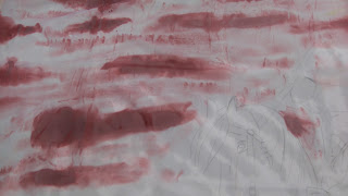
In class we have been looking at producing an advertisement for the Border Reivers festival. Our options were to design a poster, banner or t-shirt. I have decided to go with a banner for my design. The scene I have chosen is a battle scene. I chose A rider and horse to be the centre of my banner, with a person from the opposition either side. My idea was to bring across the fear and intimation felt by, all those caught up in the fight.
At first I projectcted the images I wanted to use onto a piece of paper. I then experimented with water colours in separate card to create a sky background. I painted my individual people with acrylic paint then positioned them in front of the sky scene. At this point, I was quite confident in how I was going to carry through to my final design. My next stage was creatting another background for the field, I used watercolour for this aswell. I set up my design then copied it and repeatedly shrunk it until I was happy with the size. While doing this, i looked at composition to see how I could alter the impact of fear and intimation. I added extra people and copied these images too, so I could compare one picture against the next. In the end I decided to go with my original design with only the 3 figures and a horse. I made different samples of colours I could use for a sky background, For this I used Batik fabric dye on wet cotton. This produced a lovely effect with each variety of colours I used.
Today was the start of my banner design. I could not decide if I preferred to have a dark blue eerie sky or a reddish yellow to resemble blood... So I done two separate examples. I started by projecting my images onto the material and using batik dye to create my sky. Im thinking of using acrylic paint to use for my people to make them stand out from the background , this is what I came up with so far..


Looking good!
ReplyDelete