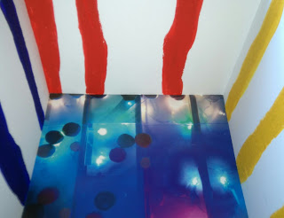
I like the bright colours in this one but i think the colours are too dark.
I think the swirl patterns work well- there is a good amount of colour and still a lot of white to reflect the flooring lights.
I feel the plain walls in this design are too plain, maybe adding a mirror on them or a pattern would work, but I probably won't use this option.
This is my favourite option so far, I wanted to use an uneven pattern so it is more fun than serious. I also tried to create texture of fruit by glueing sand to the card before painting over. Although this worked, it feels like a fine sandpaper.
I will construct my flooring again and try these options again to give me a clearer idea of what would work best.


No comments:
Post a Comment