A few days ago I went to an Art Exhibition in Jedburgh, in the Scottish Borders. It was a 3 day exhibition where a small group of Artists gathered to express their view through their work on a large scale.
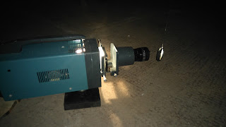
The first Artist I met Was James Wyness, he used music, noise and sound in space for his inspiration. I was able to witness his work in action as he played various sounds through a speaker. His investigation was to see the behaviour of amplified and acoustic sound and music in a large air space to see if there were variations through interventions. The sounds were mainly high pitched, single notes combined together to make 'noise', there was no rhythm or music flow. Although this was an interesting art form, I didn't really take to it but it may be more appealing to others.

I also saw the work of Graham Patterson, unfortunately I did not get to meet him but his work instantly grabbed my attention. The main thought for Graham's work was to recreate the the movement of water and patterns from the sea. For one of his art pieces, he had a bowl of water taken from the sea (spittal, I think) sitting infront of a fan heater and projector. The heater was situated at the side of the bowl and positioned so that the air was directed onto the water. The room was dark, so that the light from the projector could reflect the wave-like patterns onto the wall. The pattern was constantly moving, resembling a steady gentle wave. This was very inspiring as I was thinking about using a water /wave idea for my photography unit at college. The other art piece he had, was using light reflected through a smooth circular piece of glass onto the wall to create a different pattern. The glass was attached in front of the light, from the ceiling and was free to move as it wanted. This effect produced a variety of circular patterns on another wall in darkness . They made me think about sunlight glisten on a gentle sea on a beautiful day. I really enjoyed his work and would be interesting in seeing more.


Then there was an Artist Felicity Bristow who had a very different style from the others. She used old materials and objects found within the building - previously a bakery, but had been empty for a long time - and used them to create her vision. There were objects such as an old door mat and oven tray used as part of her work, these were suspended from the ceiling with paper attached , dropping down into a liquid substance on the floor in another tray. I would imagine that the paper was a form of parchment paper but I am unsure, and the liquid looked as if there was ink or dye within it. I thought this idea was a great use of materials and I liked the patterns made by the liquid moving up the paper, there was a few different colours which made it appealing to look at. Another piece she had done, was using coloured thread attached at various points across the stretch of a wall, I must admit, this wasn't my favourite work but it was interesting to look at and could be interpreted in many different ways.


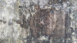


The final Artist that was there was Niall Campbell, who is a lecturer at Borders College. The idea behind Niall's work was Hidden history and hidden meanings. To create his vision, he used a series of etchings and pattern designs which he made himself and printed these onto a large wall space within the building. There was a variety of different designs used throughout his art work but he was presenting his work as one large piece. The purpose of his art was to show a hidden meaning of depth and layers. By using a layered effect on the wall through his print making, Niall was able to create an interesting idea of how an image is not necessary what it first appears. At first when I looked at the wall I could see various patterns, repeated and repositioned. The patterns on the wall looked like there had been wallpaper or a painted design beneath the crumbled, uneven surface layer, this was exactly as it was meant to look. Niall explained that seeing something as it is, does not mean that you are seeing the true self. That there are hidden layers and messages that not everyone can see. As people, we all have our individual characteristics which are on the surface, but does anyone see what lies beneath? He wanted to make people think about internal space, both physical and mental. This was a very inspirational piece which I was able to relate to. Currently, I am working on a photography portfolio where I am creating a visual image of depth within myself, focusing on the side of me that people dont see. I want to produce images showing what lies beneath the surface and present my photographs effectively to enhance the emotion. I felt that by going to the exhibition I was able to experience work with a similar idea, which gave me the extra confidence in what I was doing. The longer I spent admiring Niall's work, the more I was able to understand and connect with the message he was expressing.


Overall I am very pleased I went to this exhibition. It was inspiring to see how differently people express themselves through their art. Each artwork was different and I was able to relate to some art more than others, which in itself is good for my own self awareness, and helping me discover my own path through expression and vision. I would definitely recommend going if another exhibition is held. I left with a completely different view of how to express art and inspired to try different techniques and effects.


