Sunday, 16 October 2016

Analytical and Synthetic Cubism

Cubism is an Art movement which began in the early twentieth century, the idea behind it was to provide a new way of representing the world. The main artist's known for their cubist artwork are: Pablo Picasso,  Georges Braque and Juan Gris. The Cubist movement was separated into two phases, the Analytical and the synthetic.
The Analytical stage was the first of the two phases. Which was approximately between 1908-12. The main characteristics of this phase were the use of fragmented shapes, used to provide multiple view points of an item or person. The object was broken down viewpoint by viewpoint to create a broken down shape. This was accompanied by the use of overlapping within the image, through other objects or a figure in front of another.  Another feature of the Analytical phase was the use of a simple colour palette. This purpose this was to create an easier overall view of the painting.  By using a wider range of colours, the focus would not be directed on the main image. Some of the well-known paintings included:
                         Georges Braque,
                    Glass on table 1909-10,
                             oil on canvas.

                         Georges Braque,
                       Mandora 1909-10,
                           oil on canvas

                            Pablo Picasso,
                        Seated Nude 1909-10,
                            oil on canvas.

These works clearly demonstrate a neutral palette with a good structure to create the ideal viewpoint.

The second phase of the Cubism movement was called the Synthetic,  this began later on, around 1912-14. The main difference between the Analytical and synthetic,  was the synthetic phase was more focused on a wider colour range including brighter colours, as well as the use of simpler shapes. The synthetic stage came about when the Artists began using textures and sometimes collage, using patterned paper or even newspaper.  The main idea in this phase was, by taking an object and flattening the shape, it didn't have any signs of a 3 dimensional object. Good examples include:
                           Pablo Picasso,
            Bottle of vieux Marc, glass,  guitar                           and newspaper 1913,
             printed paper and ink on paper

                            Pablo Picasso,
                        Bowl of fruit,  violin
                          and bottle 1914,
                            oil on canvas.

                               Juan Gris,
                       The sunblind 1914,
                  Gouache,  collage,  chalk
                  and charcoal on canvas.

                                Juan Gris,
      Bottle of Rum and Newspaper 1913-14.
                           Oil on canvas

When comparing the Artwork from the Analytical phase against the Synthetic phase there is a variety of differences.  Although Picasso used many shades of blues while Braque used a palette of mostly browns and beige in the Analytical phase. It is clear to see there is a smoothness to the paintings,  even though the shapes are angular.  From the Synthetic phase,  mixed media has been used to give a sense of shape in a 2 dimensional form.
Personally,  I prefer the Analytical phase as I like the use of tone and line to create shapes and objects.  I also like the variety of colour used from such a simple palette.

Friday, 7 October 2016

Wasps Artists Studios

I went to Wasp Artist Studios in Selkirk over the weekend to see an exhibition of Artists work.  There is approximately 15 Artists currently working at the Studios,  each one with a different style and technique.
It was a great opportunity to go along and admire the different Artworks as well as walking round the Artists Studio space. I was also lucky enough to speak to a few of the Artists. Mary Morrison,  Moy Mackay, Liz Douglas and Colin Philip were the Artists I managed to speak with, they were all very friendly and informative with explaining their work and what inspires them. I especially enjoyed meeting Colin Philip, I thought his work was amazing.  His main medium is acrylic paint but he also works in charcoal and does photography.  The way he was able to create texture and add light and shadow into some of his city scenes was amazing to see. I also spoke with Liz Douglas,  where she described how she done her papermaking.
I had an amazing time and I am so pleased that I didn't miss this amazing opportunity.  Below are some of the artworks from various Artists that I found interesting :


Thursday, 6 October 2016

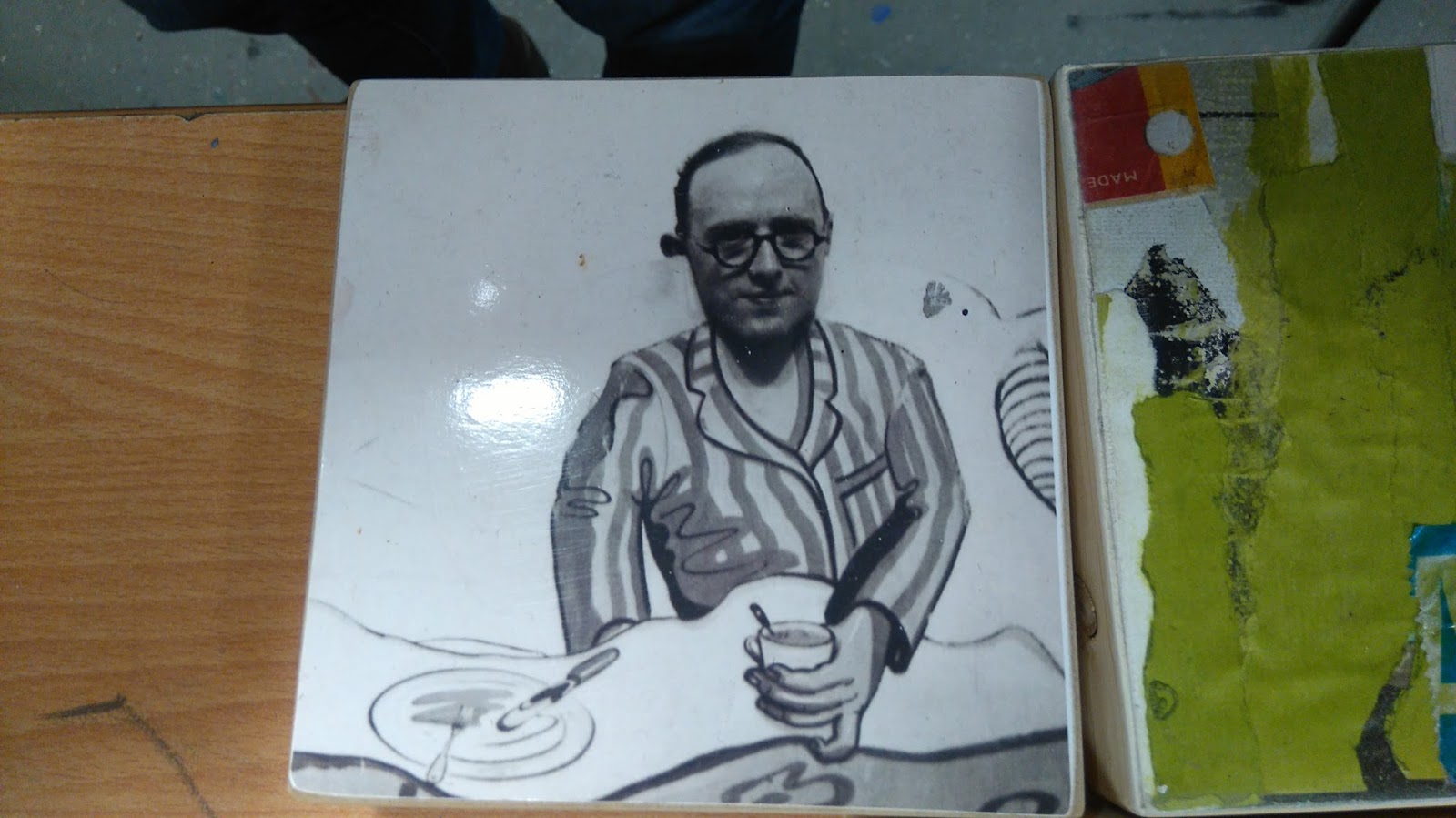
Artist Presentation - John Berry

Artist John Berry came to do a presentation at college a couple of days ago. He is a local artist who has been working at the Wasp art studios for 10 years, which is situated in Selkirk in the Scottish Borders. Berry explained that throughout school,  he felt he had a different view than others,  he never settled within one group of people.  It wasn't until he began college in 1979, that he studied illustration and developed his interest in art. After college,  Berry then moved to London and spent the next 10 years doing illustration,  during this time he also worked as an artist on,  "The Snowman"  film. After that, Berry spent his time trying a variety of different work, he done some graphic design work, illustration, taught in Devon and even taught English in Istanbul.
Berry was inspired throughout his career by artists such as, Picasso,  for his association with collage, and Kurt schwitters.  Schwitters was a "massive inspiration"  to Berry.  Berry's style of work was analogue based, where he would use glue and scissors as his tools alongside his paper cuttings.  Although he was interested in graphic design and digital art, he preferred to take a hands on approach to produce his work.  The main materials for berry's work includes a large variety of unwanted things,  such as: books, magazines,  old black and white photos,  fabric,  tissue paper and discarded receipts, postcards, bus tickets and anything else he can find that's suitable.
Berry like his collages to be humorous,  fun and light hearted. Some of the collages he presented had animal heads on human bodies, some of which resembled a surrealism feel. He would also place people in "Out of context"  situations,  like cutting out images of people on a beach and placing them in a city scene.
Berry was very informative about how he approaches his work and what his interests are. I would have liked to see his illustrations though, as I am interested in his drawing style. Overall,  I felt it was a good presentation and it was interesting to see a different style of work in comparison to other Artists. Some of the artwork I found interesting is shown below :


Monday, 3 October 2016

Dada Artist- Hannah Hoch

Hannah Hoch was born 01/11/1889 and died 31/05/1978. She was the pioneer of the photomontage and was known for her political art from the Dada movement.
The way Hoch worked, was by combining unrelated images to provide a variety of shocking and interesting art works. She was an inspiration to many artist's - present and future- including other Dadaists,  artist's part of the surrealist movement,  post modern artist's and those part of the sculptural installation.  Hoch was interested in challenging the ideas of a women's place within society,  she wanted to use her artwork to provide a sense of power as a woman and to influence and encourage other women to feel free and strong.
Hochs most important artwork includes: Cut with the kitchen knife through the last weimar Beer-Belly cultural Epoch in Germany (1919-20),
Heads of state (1918-20),
Industrial landscape (1967),
High Finance (1923) as well as many others.


Heads of state (1918-20) is an image consisting of German president Fredrich Elbert and his minister of Defence,  Gustav Noske. Hoch decided to place the men in an out of context situation by wearing bathing suits,  providing a silliness to the image. The background is an embroidery pattern of flowers and butterflies surrounding a woman which is quite feminine. The overall image is humorous but contains a powerful message.  Hoch has positioned the men in a idiotic situation taking away their masculinity. Also showing that they have a disregard for the serious financial  and political problems, which was faced by the people of Germany at this time. The background represents the income and occupation for many German women,  including Hoch. It is also a statement of the differences between men and women.


High Finance (1923) is an image consisting of two bankers with over exaggerated heads, one of which is Sir John Herschel, a British chemist and astronomer.  Hoch has paid close attention to composition and the message she is portraying.  One banker has his head sliced in half with 2 shotguns aimed at the banker behind him. There is alot going on within this image, including providing a sense of industrialism and it represents the financial power in post WW1 Germany. The bankers are an important part of this photomontage as they provide the link between military complexities and those who financed them.

Thursday, 29 September 2016

Francisco José de Goya y Lucientes - printmaker

Francisco José de Goya y Lucientes, born 30th March 1746, Fuendetosdos, Aragon, Spain, died on 16th April 1828 (aged 82) Bordeaux, France.
Goya was known as the most important Spanish Artist of his time, He was a Spanish romantic painter and print maker. As well as producing linographs, he also made etchings. For his etchings, Goya was influenced by the work of Giovanni Battista, where he then produced some outstanding effects.
Between 1810 and 1820, Goya made a series of 82 prints which he named,  Disasters of war. Although he never made it clear,  some art historians suggested that he had intended to use the  plates as a visual protest against the violence of 1808 Dos de maya uprising,  the subsequent peninsular war battle.
I began to study Goya's artwork  this series and found it interesting and a good idea to produce such work. It is clear that the images are dark and disturbing to look at, but I felt they contained depth into the violence against individual people. I felt this was better than a battle scene for example as it provided a strong sense of devastation. One image battle caught my eye was, Plate 4: Las mujeres Dan valor.
The print contains two people attacked by soldiers, with the fear in the woman's eyes being the focal point of this image. It is an image of the harsh reality of pain, weakness and defeat. I feel this is presented in the woman's eyes as she looks away from whats happening.  The soldier attacking the person on the right has been well done. Through the angle of arms,  the soldier is clearly presenting power over the person they have hold off. The use of line work and shading also adds this. I feel the way that the soldiers hand is firmly grabbing the persons head expresses intimidation and pain very well,  you can almost imagine the force of this action,  especially through the coverage of the head. This is the key point of the image providing vulnerability and violence all at the same time.


I also found Plate 5: y son fieras (and they are fierce) interesting.  I feel this print has alot more going on compared to Plate 4. The main point is the woman holding a spear as well as a baby , fighting against the soldiers. The image is incredible in portraying the extent of the violence.  This isn't a battle scene or man against man, this is a woman holding a baby in one arm and fighting with the other, absolutely shocking. This image is quite sad to look at,as I could only guess that the soldiers won this battle and that the baby,  as well as the rest of the civilians didn't survive.

Plate 36: Tampoco is a different plate from the others I have described.  Its a cold,  sad image of a man hanging from a tree. At first glance, I was Saddened by the horrific image, then I began to wonder what had happened previous to the hanging.  Was the man tortured,  taken away from his family or did his family even know that he would not return home. In the background there are two other people hanging from trees, which suggests that this was almost a statement of achievement for the soldiers.  The soldier positioned to the right of the image looks satisfied with what he has done,  almost gloating.  This image just makes me feel sad. A life has ended and there is nothing left,  no loving goodbye,  no proper burial and a brutal death.
I have learnt alot by studying the "disaster of war" artworks created by Goya. I am not sure why these prints were made but I feel the purpose was to provide the harsh reality of war on a more personal level including women and children as a large part of the series.  It is quite a dark series of artworks. This style does not appeal to me but I would like to study them further to gain a better understanding of the brutal reality of war.

Monday, 26 September 2016

Impressionism

Impressionism is a movement which began in the 19th century in France.  The idea behind it,  was that most Artists painted outside to capture a moment in time. This could either be in the form of landscape portraits or of people as they were at that moment in time. Artists including Claude Monet,Edgar Degas,Auguste Renoir, Gustave Caillibotte and Paul Cezanne were all part of the impressionism movement in the early 1900s. It wasn't long after the movement began that British Artists such as Walter Edwards Sickert and Wilson Steer were influenced and created their work inspired by impressionism.
Artists who were part of the Impressionism movement play a large part in our history,  with their help we are given insight into what life used to be like before the modern technology we have these days. Today we have advanced in so many ways through all aspects of life. As far as technology goes, We have mobile phones,  computers,  flat screen TVs and Led lights.  We also have electric trains, air conditioning and online shopping.  Our world has advanced in so many ways in the last 100 years, that's why the impressionist paintings are so valuable.
Impressionist Artists have been able to capture a moment in time through their work, The details in every painting provides an idea of how things used to be. One of my favourite images which reflects the effects of industrial revolution is: Paris Street,  Rainy day (1877) by Gustave Caillebotte

This is a perfect example of how a normal day in Paris would be. The painting shows a man and woman smartly dressed walking casually through a street,  behind them, there is a street light which suggests that there weren't any electric Street lights.  It is difficult to image what life must have been like in the late 1900s, especially nowadays,  where we use electric and solar power. Its safe to say, the majority of us would feel lost. Another key point in this painting is the clothing in which the people are wearing.  Back when this was created,  people would have to visit a tailor or seamstress to have their clothing made. The colours were very plain also, Not like the vast majority of colours,  style,  texture and pattern design we have today.  I must admit, although I wouldn't change anything,  I do feel like the fashion designers have slightly lost control of practicality and purpose. Who would ever have believed that an outfit made of meat, worn by pop star Lady Gaga would ever be made?! Clothing seemed less complicated in those days.
Another Artist who's work I admire is Claude Monet.  Monet's passion was to create real sense of  natural light within his work. Although he explored this through many of his flower paintings,  the painting I found most interesting was: La Gare Saint-Lazar (1877)
 I feel this is a perfect image of a time unknown. Every detail in this painting provides evidence to how different transport used to be. The steam engine is the centre focal point, it provides a statement of a solid product of industry.  A steam engine, was once modern and new but now, it is a part of the past. This is why it is the perfect example to show the effect of industrial revolution.
I have enjoyed learning about the impressionism movement,  I am interested in studying the works of various Artists and see how they compare. I like the idea that an moment in time has been captured and I find it fascinating.

Self portrait wearing a hat

In class we were asked to do a self portrait wearing a hat. I was quite anxious as I struggle with self portraits-or drawing people in general.  I started with a side view and was quite pleased for my first real attempt.  I then drew another image face-on. Again,  I was quite pleased with the result.  I do struggle with shading more than anything but this is what I came up with:


Saturday, 24 September 2016

Artist Presentation - Kerry Jones


Kerry Jones is a multimedia Artist based in the Scottish Borders,  before moving to the Borders,  kerry gained her degree in Hull, England. The work she is doing now consists of a variety of film making,  sound archives and making still images, which is a very different style from when she left her studies.
Kerry has always had a passion for time travel and a curiosity about the past and present.  One of her first projects started off in an abandoned factory, where coal and coke was everywhere and it was completely overgrown.  She decided to use this factory for an Art piece by laying turf on the floor to resemble coke slabs growing out.  Not long after this,  Kerry done a similar project in "the square" chapel in Halifax.  This time,  she was interested in the idea of history and packaging.  There were numerous clear bags suspended from the beams containing dirt,  this was to represent sanitising and packaging in the past. As well as a few other projects,  Kerry also took part in covering the front of an abandoned dole office with words taken from the Guardian and TV guide,  she was inspired by the cut up technique by William Burroughs.
After realising that she wasn't making enough money through her art work,  Kerry decided to train as a carpenter, this lead to her new passion for making giant puppets.  She created them based on ideas of stereotypes and took them to festivals,  book fairs and schools.  she liked the social side of her work, bringing people together within the community and entertaining a variety of age groups.
Continuing her Art work working within the community,  Kerry worked as part of a group with other Artists to create a display in 3 windows throughout the town of Galashiels.  The theme was 100 years in history of local children.  The first window display contained a film projector playing a short film containing shadow puppets,  this was to entertain children. the year for this window display was set to represent 1900-1945. A second window represented 1945-1975 and the third was inspired by 1980-present. Each window was different from the next with use of old photographs from that era. This project provided Kerry with a curiosity for using her skills to alter old pictures of Galashiels.
Kerry began to take old photos of Galashiels  from approximately 1930s and add modern day clothing on the people in the pictures.  The idea behind this was to create a unique series of images influenced by time travel.  She also coloured in the sky blue and add features to the buildings in the pictures,  for this she used a variety of media including pens, oil pastels and paint.


 Kerry's art work was soon noticed and she was asked to create a series of 6 images for a shop window in Hawick for an exhibition,  below are a couple of images that were included :


Kerry decided to expand her talent by using a mixture of sound and still images to make funny videos. She also included her puppets in some of these videos,  this idea was inspired by the recent work she had done. One video she made was called Virtually nonexistent,  she liked the idea of a mind warp. 
Kerry's newest adventure involves working Alchemy film festival where her film work has been presented. 
I really enjoyed meeting Kerry, she is an enthusiastic person and very talented.  I really like her style of work and found that I shared a few common interests.  I am inspired by the way she works and I am very interested to see what else she will be doing in the future.