
Friday, 30 December 2016
Self portrait wearing a party hat
I was asked to create a self portrait wearing a party hat. I decided to use just pencil so that I could practice my line work and tone. I have not got an amused expression because I feel party hats belong in the same category as fake new-year "friends" and unnecessary family gatherings. I do love this festive season but not any of the fake people that come along with it. I feel this party hat reminds me of what truly matters and the true meaning of Christmas.


Thursday, 22 December 2016
Jim Dine - prints
Jim Dine was an American Painter, graphic Artist, Sculptor and poet. He was first noticed during the Pop art movement, where he was noticed for his work on canvas which included the use of ordinary, everyday objects. During the 1960s, he was noticed for his work where he made prints of tools, clothes and other household objects, including cutlery and paint brushes and bathrobes. As well as this work, he also made a series of images named, "The crash". These prints were similar as they were only in black, it is also noticeable that there is a similar technique and style within his work. Throughout his print work, Dine adds energy and movement by using various tone and line work. He also creates a detailed image through use of depth of tone and shadows A few of my favourite pieces include :


Untitled
1973

Untitled
1973

Untitled
1973

The crash #5
1960
Thursday, 15 December 2016
My face
I was asked to produce some images over the last 6 weeks of sections of my face. After each section I was told to place the drawing in a separate location so i wasn't able to line up each section. For this task, I used charcoal pencils on a5 paper.
Once I pieced the sections together, I realised how wrong I had got it, my first thought was I look like an alien. My eyes are huge in comparison to the size of my face and my lips dont match up. I found this amusing and interesting but would like to think I could produce a better result next time.

Once I pieced the sections together, I realised how wrong I had got it, my first thought was I look like an alien. My eyes are huge in comparison to the size of my face and my lips dont match up. I found this amusing and interesting but would like to think I could produce a better result next time.

Wednesday, 14 December 2016
Antonio Tapies
Antoni Tapies (1923-2012) was a Catalan Artist who was known for introducing contemporary abstract painting into Spain. He began his career as a Surrealist Artist, with no previous training. He was however, influenced by the work of Surrealist Artists, Joan Miro and Paul Klee. In 1950 he found influence from the work of Jean Dubuffet which guided him into a career in Abstract painting. Through this, Tapies used a variety of media in creating his work. He would use materials such as thread, cardboard, Ash, rope, clay and newspaper in some of his work. Following this, he began to create lithographs which were described as having, "cryptic spontaneous effects". Tapies work was slightly different from other Abstract Artists of his time, He used a more traditional style within his work. This was a especially noticeable through his prints, but he still managed to relate his print work with his paintings and sculptures.
Tapies was keen to experiment with texture and techniques when producing his prints. In some, he used technique such as collagraph, collage, flocking, leaning and folding.
Below are a few of my favourite prints by Tapies:


It is clear to see that they are quite similar in technique. I feel energy in each of these prints but there is also a sense of darkness and mystery in his style. I like the sharpness of his line work and depth within the colours. I am also drawn to the simplistic design, although not busy in appearance, I feel there is much to see. I am very interested in learning more.
Tapies was keen to experiment with texture and techniques when producing his prints. In some, he used technique such as collagraph, collage, flocking, leaning and folding.
Below are a few of my favourite prints by Tapies:

Als Mestres de Catalunya
1974
Linograph in colour on wove paper

Arc i Creu
1982
Etching on paper Guarro

From the colimbus portfolio

Untitled
1972

O.T
1970

Fulla
1987
It is clear to see that they are quite similar in technique. I feel energy in each of these prints but there is also a sense of darkness and mystery in his style. I like the sharpness of his line work and depth within the colours. I am also drawn to the simplistic design, although not busy in appearance, I feel there is much to see. I am very interested in learning more.
Experimenting with paint
These last few weeks I have been experimenting with a variety of paint to see the difference in texture, consistency and what paint would be suitable for each occasion.


 I spent 2hrs on this acrylic painting, I usually enjoy using acrylic paint but I felt that it dried too quick and I was unable to add tone like the oil paint.

By using watercolours, I was able to produce a calm, easy to look at picture. I was also able to add tone easily.

I began by using oil paint mixed with turps for the background and "fat" oil over the top to add in the objects. I enjoyed using oils as I was able to manipulate the colour and thickness of the paint by adding turps. It was also a benefit using oil paint as I didn't dry quick, which meant I could change the colour if I needed to.

Thursday, 8 December 2016
Richard Hamilton - prints
Richard Hamilton is known as one of the most influential artists of the twentieth century. He is best known for his pop art in the 1960s but also created some incredible prints. One of his first screenprints was created while teaching at a university in Newcastle-upon-Tyne, where he had been teaching since 1953. The print was called, My Marilyn, 1965.
After finding an interest in screenprinting, Hamilton decided to translate most of his important pop art work into screenprints. This inspired others to follow in his footsteps to do the same. By discovering screenprinting, Hamilton was able to reinterpret themes and images he was investigating in his paintings. He also began exploring printmaking and collage. A good example of this would be Interior (1964) this was inspired by the film Shockproof (1949). Hamilton focused on a still from the film, which contained a girl wearing a "new look" coat. Hamilton paid close attention to the lighting on the still, discovering that the light was artificial due to the various directions. He also looked at the composition within the image. This was an increasing interest of Hamilton and he repeated this process with other works such as, "im dreaming of a black Christmas 1971" and "my Marilyn 1956"
I found Richard Hamilton to have an interesting use of collage and screen print. By using colour and line carefully he is able to produce such interesting images.


After finding an interest in screenprinting, Hamilton decided to translate most of his important pop art work into screenprints. This inspired others to follow in his footsteps to do the same. By discovering screenprinting, Hamilton was able to reinterpret themes and images he was investigating in his paintings. He also began exploring printmaking and collage. A good example of this would be Interior (1964) this was inspired by the film Shockproof (1949). Hamilton focused on a still from the film, which contained a girl wearing a "new look" coat. Hamilton paid close attention to the lighting on the still, discovering that the light was artificial due to the various directions. He also looked at the composition within the image. This was an increasing interest of Hamilton and he repeated this process with other works such as, "im dreaming of a black Christmas 1971" and "my Marilyn 1956"
I found Richard Hamilton to have an interesting use of collage and screen print. By using colour and line carefully he is able to produce such interesting images.

A still from the film, Shockproof 1949

Interior 1- inspired by the still from the film Shockproof 1949

My Marilyn 1965

Im dreaming of a black Christmas 1971
Thursday, 1 December 2016
Georgio Morandi - etchings
Giorgio Morandi (1890-1964) was an Italian painter and etcher. His main style was creating still life and landscapes. He was familiar with the work of Renoir, Monet and Cezanne aswell as finding inspiration from Giotto, Pierre della Francesca and Uccello. Morandi was very particular in the way in which he worked, he would spend a considerable amount of time contemplating each element of his work. When setting up a still life, it could take him weeks to chose the correct objects for his focus. He would consider the shape, colour, angel and arrangement of the objects, then he would look at composition and colour balance. Between the 1920s and 1930s Morandi produced his etchings, where some of his work was influenced by the fascist regime. At this time, fasism had a large impact on social life and the arts.
Morandi was able to produce highly detailed etchings because of his technique in mark making and colour balance. He was also great at using variations of black and white to make realistic looking objects. He was very talented being able to create form and depth through his observation of still objects.


Morandi was able to produce highly detailed etchings because of his technique in mark making and colour balance. He was also great at using variations of black and white to make realistic looking objects. He was very talented being able to create form and depth through his observation of still objects.

I like the contrast of colour to create a variation of tone. The image almost looks photographic with the careful attention to detail.


This piece uses interesting shapes for the buildings, it almost adds an energy and a positive feel to the image.


I like this image because there is a 3 dimentional feel to this image due to the attention to the angle of the bridge. A lovely scene.

This is another piece I felt was full of attention to detail. By careful use of mark making, the tree stands out from the background to create a picture like image.
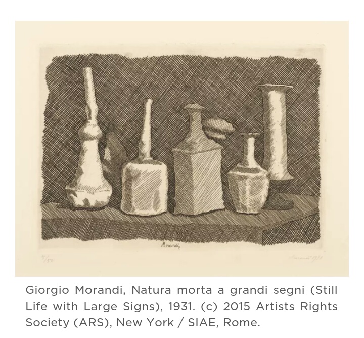
This was created during Morandis mature period where it was said the objects started to lose their contour. The shapes are more loose and curved so they do not seem as realistic as his previous work. This is one of my favourite prints because it has a personal quality to it rather that a "perfect" image.
Wednesday, 16 November 2016
Rembrandt: the descent from the cross
I was asked to look at 3 stages of, "the descent from the cross" by Rembrandt Harmenszoon van Rijn. The first image I found entitled, "The descent from the cross: a sketch, 1642.
 This was the first image created of this scene, it was made by etching and dry point in paper. The image is off Christ hanging on the cross after his death. There is a figure pulling out the nails from his body, while other support him with a stretch of material wrapped round his upper half-This image is very sad to look at. There is someone looking as though he is praying under the cross, as well as onlookers bowing their heads in sorrow and disbelief.

The second image I found was," descent from the cross: the second plate", 1633. This was made by etching and engraving on paper. Although this plate was made earlier that the previous one I mentioned, there is clearly more detail within this image. Straight away, I am aware that it is a very different image from the first. The angle which Rembrandt has drew from provides more depth into the image as a whole. The first observation I made was the use of light and dark when the light is shining down on Christ. This alone acts as a spiritual feeling for the entire image. The darkness of the background adds to the eeriness and disgust of what had happened. It is also clear to see that the people in the image are caring and considerate for Christ's body. This is shown through them supporting him while gently lowering him down. Onlookers are also fixated on the body of Christ, I am unsure if it is more of a curiosity, or if it is in disbelief.

The third image, "The descent from the cross by torchlight", 1654, etching and dry point printed on Japanese paper. Again, this image is completely different from the other two. The overall feel of the print is darker than the other two, this print shows a stretcher being prepared to remove the body from the scene. I feel this is more of a finalised emotion, that there is nothing left to feel, other than woe.
I found this a slightly difficult task as I wasn't sure if I should have included,
 "Christ presented to the people"
or
 "Christ crucified between the two thieves:the three crosses".
However, I feel that I have achieved a better understanding of the approach and emotion felt at the crucifixion of Christ.


The second image I found was," descent from the cross: the second plate", 1633. This was made by etching and engraving on paper. Although this plate was made earlier that the previous one I mentioned, there is clearly more detail within this image. Straight away, I am aware that it is a very different image from the first. The angle which Rembrandt has drew from provides more depth into the image as a whole. The first observation I made was the use of light and dark when the light is shining down on Christ. This alone acts as a spiritual feeling for the entire image. The darkness of the background adds to the eeriness and disgust of what had happened. It is also clear to see that the people in the image are caring and considerate for Christ's body. This is shown through them supporting him while gently lowering him down. Onlookers are also fixated on the body of Christ, I am unsure if it is more of a curiosity, or if it is in disbelief.

The third image, "The descent from the cross by torchlight", 1654, etching and dry point printed on Japanese paper. Again, this image is completely different from the other two. The overall feel of the print is darker than the other two, this print shows a stretcher being prepared to remove the body from the scene. I feel this is more of a finalised emotion, that there is nothing left to feel, other than woe.
I found this a slightly difficult task as I wasn't sure if I should have included,

or

However, I feel that I have achieved a better understanding of the approach and emotion felt at the crucifixion of Christ.
Subscribe to:
Posts (Atom)