Wednesday, 25 November 2015
The Border Reivers
In class we have been doing a project on The Border Reivers. We need to investigate what the Reivers were about and to show our understanding. We need to create 3 designs, they can be a poster, banner and/or T-shirt to advertise the Border Reivers. I have done some quick drawings of some ideas I've had but now I need to collect more evidence to develop my ideas, and decide what design I am going to do.
Saturday, 21 November 2015
Museum visit
On Wednesday we went to the wilton museum in Hawick to look at an Art exhibition. We saw some lovely paintings, photography and prints as well as a sculpture of a kite. There was approximately 6 different artist who took part in exhibition and their work was displayed amongst some older work. I found it great to look around at the different styles and techniques each artist has used. It made me think what my style was like. Although there were a few pieces I found interesting, my favourite one out of everything was "ploughed field" by william Johnstone, circa 1970. I found the painting to be very interesting and the longer I looked at it, the more I could see. I am still interested to find out exactly what the idea is behind the painting. Overall I had a lovely time feel better about experimenting with my work and working on a larger scale. I took some photos and ive decided to present them in a collage to group each artists work.
Tuesday, 17 November 2015
Menu design. First development
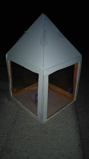
I was trying to further a design for my class project. I was looking into designing a menu for a cafe. I started by thinking about a 3 dimensional shape, which I wanted to do a model off. I first thought about a solid shape, then developed my idea further. An idea of using light was suggested to me, this gave me loads of inspiration. I started with a 12x12cm square shape for the Base, then 12x12cm for the for side panels. I decided on 6cm length for the roof of the menu but later found out it was too short. My next attempt was 12x12cm for the Base, 12x12cm for the side panels, then I tried 10cm length for the roof. This worked perfectly. I wanted to try something else so I then decided to use orange acetate for the side panels. I cut 10x10cm out of each side panel, leaving a 1cm gap either side. I found a blue light which I inserted into my finished prototype. I think this has worked very well for a first attempt. My next stage would be to develop my idea and enlarge the whole product. I would also need to find a solid insert that would work in-front of the acetate for a readable menu.
Tuesday, 10 November 2015
The panel with the mask, Henri Matisse, Fauvism
In class we have been learning about Henri Matisse and Fauvism. I have learned that Matisse started to create art later on in life, but is known as a great artist in Fauvism and still well known for his talent today. We were to take a picture from the 'cut out' art and recreate it ourselfs. The one that instantly inspired me was, "The panel with mask " which was created in 1947. The original was put together using gouache on paper, cut and pasted and measured 110x53cm. I found the bright, vibrant colours very interesting and could not wait to get started. I am aware that this particular piece does not look difficult to replicate-due to its simplicity - it wasn't. That is what I like about it, not that it looked easy, but because the colours were amazing and I knew I could work with it and come up with something quickly and impressive. I used a variety of acrylic paints to create the background and some of the shapes on top, as well as white paper. I cut and pasted the shapes and this is what I came up with. The first image is the original. I thoroughly enjoyed doing this, I think this is my favourite movement so far.
Friday, 6 November 2015
Design craft-butterfly
I have been looking for an idea for a design craft for my project at college. I saw a butterfly at the Haining when we went for a visit. I thought that creating a butterfly out of different coloured buttons would be a good idea. After trying this I have found that it did not work as well as expected. I will not be using this for one of my final designs, I will maybe redo the butterfly with acrylics or pencils.
Lino cutting
In class we had our first go at lino cutting. For my design I decided to do a tree. I split the image in half and cut out on opposite sides. The reason for this was because I thought it would make a more interesting pattern. I could use it as a repeat pattern by printing the image side by side or I could place ink on one side only and repeat the half tree for a different effect. I really enjoyed it and would like to do more.
Subscribe to:
Comments (Atom)


