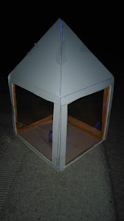
I was trying to further a design for my class project. I was looking into designing a menu for a cafe. I started by thinking about a 3 dimensional shape, which I wanted to do a model off. I first thought about a solid shape, then developed my idea further. An idea of using light was suggested to me, this gave me loads of inspiration. I started with a 12x12cm square shape for the Base, then 12x12cm for the for side panels. I decided on 6cm length for the roof of the menu but later found out it was too short. My next attempt was 12x12cm for the Base, 12x12cm for the side panels, then I tried 10cm length for the roof. This worked perfectly. I wanted to try something else so I then decided to use orange acetate for the side panels. I cut 10x10cm out of each side panel, leaving a 1cm gap either side. I found a blue light which I inserted into my finished prototype. I think this has worked very well for a first attempt. My next stage would be to develop my idea and enlarge the whole product. I would also need to find a solid insert that would work in-front of the acetate for a readable menu.


No comments:
Post a Comment