Wednesday 30 March 2016

creative project Tutti Frutti Juice Bar

For my assessment, i chose to do a Product design, which involved designing a Juice bar with the theme "Tutti Frutti".
For my project my design involved making an interior and exterior of a Juice bar. Instantly i was attracted to this idea, i felt excited about what i could do through colour and imagery.  After thinking about who my target audience would be, i decided that 18-30year olds would be the best option. The reason for this, was so that i could make a design appealing to a wider audience, i felt that narrowing the theme to either teenagers or using a sophisticated theme would limit who would all go.
I researched artists and designers to inspire me on the type of furniture i would use and overall design for the interior and exterior. Marcel Breuer was a large influence on chair design, i felt he had a unique and interesting style. i also found the work of Phillipe Starck very interesting. He used bright colours as well as unique designs throughout his work. The Rockwell group and David Collins were great for inspiration on interior Design.
For my research, i wanted to give myself the best opportunity in creating my design. I began with photographing a variety of fruit to se what i think would work best through colour and texture. I then made sketches and drawings to get a feel for how i could work with shape and form and use it in my style.
Initially when constructing my first model, i used mount board, only to find that it did not produce a great effect when painted. I also felt that it wouldn't be sturdy which would possibly effect my final outcome. I then tried foam board which worked a lot better, it was sturdy, easy to cut and when painted , the colours were more vibrant.
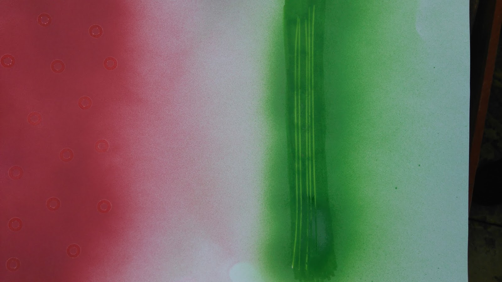
The main problem that i had was deciding what type of paint to use, i was going to use acrylic paint from the beginning but felt that the paint was heavy in colour. Near the end of my design process i used spray paint and found that the colour and texture was perfect for how i wanted my design to look.
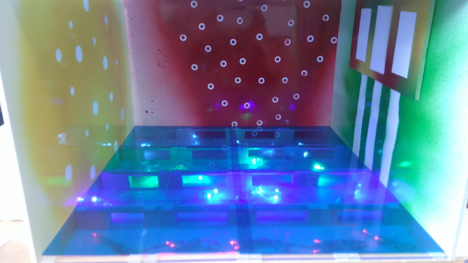
I believe that through my design i gave a lot of thought about making my Juice bar "fit for purpose". I paid close attention to seating, disability access and spacing between seating.
My final design is presented as a3D model, i am very pleased with the result especially the underfloor lighting which i added, using red, green, blue and yellow to represent the colours of fruit.

Tuesday 29 March 2016

Assessment - part 1 Tutti Frutti juice bar design

Its time for the final design for the Tutti Frutti juice bar.  Today I constructed the first part of my final design.
I started by making a Base for my model to sit on. I then set out strips of balsa wood, Equally spaced with wooden blocks, positioned evenly along each strip, with another strip of balsa wood on top. I glued them together and started adding the under flooring lights along the Base  sticking them down with tape. I made a collection of the battery cases in the back corner of the juice bar, (the electric cupboard).
Next, I carefully added the clear acrylic tiles to the top layer of balsa wood with double adhesive tape. This was easy to assemble as the measurements were perfect. I then spent time adding blue acetate on top of the acrylic tiles to add effect, and to disguise the strings from the lights underneath. The acetate is a darker blue than I would have liked but it still works well.
I started to construct the outer walls and inner sections of the juice bar,  adding doors and serving bar along with the seating. I also made the menu and attached it to the wall insert.
Finally,  I spent time adding the finishing touches to the entrance of the juice bar. I have not attached it to the rest of the design but it will be the first thing I do tomorrow. At this stage I am pleased with what I have achieved but still have a lot to do to complete my design.


Sunday 27 March 2016

The Haining visit

The other day we went to The Haining in Selkirk for a day out at college. There was a 3 day exhibition on with a variety of designers and artists sharing their skills with students and other designers.  We went on the second day where we learned about glass cutting and shaping.  At first I wasn't sure if I would be interested in glass cutting, but after experimenting with a few techniques,  I really enjoyed it and felt inspired to do more.
I then had a walk around the grounds including the lake to take some photos.  I am also working on a photography unit so this was a great opportunity to see what I could find in the way of reflections and composition within the woodland.  I feel that I achieved quite alot as it was a beautiful day, the sun was a great advantage in finding reflections.
After that, I took a mirror and placed it in different areas around the building,  I wanted to see if I could use the reflections to make an interesting image.  This worked well but I would have been better taking more time with this idea to improve on the end result. I also used coloured glass as a filter and took a photo of a tree next to the lake,  this produced interesting results,  giving insight into changing time of day or mood of an image.
For the final task,  we were asked to create something within the surroundings using mirrors and glass to see what reflections we could make- this was fun. As a group we cut pieces of glass and mirror using the techniques we had learned earlier.  We used a variety of colours and shapes then attached them to a pole with string. The idea was to let the light of the sun reflect of the glass and produce coloured patterns on the ground.  Unfortunately it was almost 3pm and the sun was starting to disappear so we were not able to produce great results.
Overall I really enjoyed the whole experience.  The glass cutting was fun and exciting,  I feel that I have learned something new and would definitely be keen to try it again. I am also pleased with the photos I took.
I would definitely recommend it to anyone who has an interest in art and design work.


Monday 21 March 2016

Caitlin steele portfolio talk

On Wednesday we had a previous college student, come into class to give us a talk on her experience on education and future career prospects.  Caitlin steele started college straight after leaving school,  she studied level 2 Art and Design, then moved onto study for 3 years at Heriot Watt University.
At first,  Caitlin studied visual communications, which was mainly working on a computer.  She then done photography, and during her 3rd year at University,  she studied Fashion Communications. I was unsure what this involved, But she explained that fashion communications was more of the editorial and designing part of fashion,  rather than working with clothing.
During the first and second year at University,  Caitlin described how she mainly spent time studying and gaining a wide knowledge about fashion,  which helped her throughout.  Her 3rd year involved a more independent study where she could create her own design style and have more freedom in doing something that was her own.
There were 2 separate portfolios containing photographs which she handed round for us to see. I was amazed at how well the photos were presented, and how minimalistic they were.  The work she had done along the way seemed to be quite a lot, but it was really nice to see only the completed product neatly presented.
For one of her final assessments, Caitlin explained that she was to hand in 3 photographs based on an Art work that inspired her from the National Museum in Edinburgh. The theme for her project was to be based on Social Media,  with the idea of hidden identity, and how people are effected by online social sites in recent years.  For the images,  Caitlin had to create a contemporary feel to her fashion photography.  She found the models and made the outfits for them herself, she also collected other materials to create her vision, Even rubbish was used in one of the images. Jeff Koons was a big inspiration to Caitlin for this project.
The main point I gathered from this talk, was that she felt that completing Level 2 Art and Design at college, was the best thing she done. It gave her a wide view of different techniques and experiences so that she was able to decide which direction of study she wanted to go in. She is very happy with the work she is doing at present at looking into beginning her career in the near future.  Another piece of advice she gave was to speak to people, such as local artists and designers who could also give advice on their experience in education and career if unsure what type of work to do.
Overall,  I thought Caitlin was very informative about her experience in Fashion Communications.  I now feel more confident in deciding what career options are available and have more of an insight into what that course entails.
I took some photographs of the work in Caitlin's portfolio,  I really like the work she has done and I am interested to learn more.


Monday 14 March 2016

Interior walls for juice bar - final design

I have spent this last week experimenting with design, texture, colour and media for the final design for my juice bar. Throughout my design process,  I was set on using acrylic paint for my interior walls and using a variety of items to create a textured effect.  I used sand, stickers and foil to see what would work best.
After experimenting with different patterns and techniques,  I was still not pleased with the design,  I felt the acrylic paint was too solid, heavy and dark. I thought about other media which I could use to produce a better effect.  I didn't want to use water colours as I am using foamboard, so I decided to try spray paint. This worked very well on foamboard but did not produce vibrant colours on mountboard.
I finally decided to have a red wall to represent strawberries,  a yellow wall to represent lemons and a green wall to represent watermelon.  My 4th wall will be used as the front of the juice bar so I will not be using colour, although my flooring will be blue to represent blueberries.  I am very pleased with the design,  the spray paint worked perfectly creating bright, vibrant colours and I was able to add a spray effect to represent juice.  I also used stickers, plastic googly eyes and ripped paper to add effect and keep some white on the walls to reflect the lights from the flooring.