Monday, 11 January 2016

My final menu design

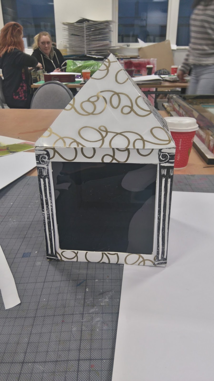
After exploring different ways of presenting a menu,  I decided that I wanted to use the pillars as part of the design. I also looked at what pattern I could add for colour.  I decided to use black acetate for 2 of the side panels for use with a light for the evening and go for a nice sophisticated look.  Although this menu is not movable,  I think this is my favourite. This may be because of the style, or the fact that I didn't get worked up about the design and I just went for it. The pillars were part of my first idea so hopefully it works well.


The haining - menu design

I have been creating a menu for my Haining project.  Initially I was thinking about designing a uniform for staff to wear in the cafe but decided to design a menu instead.  I looked for some inspiration to help with my design.  I remember when I went to visit the Haining,  I noticed the loch,  the grand overall size of the house and the details on the outside of the building,  such as the pillars,  the balcony and the flower pattern on the front of the building.  On the grounds surrounding the building,  I remember the beautiful woodland and the red and orange flowers (crocosmia) surrounding the building. My first idea was to enlarge photos that I took of the loch,  woodland,  house etc,  then I thought about the building itself and the features on it.  I knew I wanted to have a cube design which I could have as a multifunctional menu and centre piece,  with the possibility of using a candle with it for the evening.  I had so many ideas streaming through my head so I decided to jump straight into the design and see what I could come up with.
My first design was 10cmx10xm with the roof height 8cm.  I cut out the side panels and inserted orange acetate, leaving a 1.5cm gap either side.  The reason for this was to add a candle, but I soon realised that with the menu constructed from only one piece of card,  it would not be practical.  Also,  the cardboard I used was quite thin so as soon as the cardboard bent,  it looked as though it would tear easy.
My next attempt,  I made the menu larger,  15x15cm, this worked much better.  I also used a thicker card to make it more sturdy.  I thought about how I could design the menu so it was practical for use and multifunctional.  I looked at various pictures I could use and thought about composition and how many sides to use as a menu.  I also had an idea of adding wheels below the menu so that it could move round the table with ease.  This is where the lengthy process began....
I constructed various designs using enlarged photographs, stickle bricks for wheels,  wooden balls and sticks for movement.  I also tried print making to create the pillars. I used orange and black acetate on the designs that I would use for using a light inside.  I feel I have explored many different ideas and options and I feel that,  as a whole I have provided a wide range of thought processes and creativity.


Sunday, 10 January 2016

Dada art - Kurt schwitters inspired collage - zero fare

At the moment my favourite medium to use is acrylic paint.  I have been keen to try different media to recreate art,  I want to broaden my range so that I have a better understanding of why artists have their favourite materials they like to use.  I began to look at the Dada movement to see if I was able to create a collage.  After looking at many artworks,  I felt most inspired by Kurt schwitters.  I like the way his main focus was not on ww1, and how he could take everyday materials such as bus tickets,  newspapers and fabric and use them to create a work of art.  At first I thought,  this would be quite simple and was probably thrown together with not much thought.  It wasn't until 20 minutes into my Dada art, that I realised there was alot more thought process. I had to think about position and composition as well as, use of colours and tones. I was also made aware of texture, and had to decide how best to add fabric.  I really enjoyed making a collage,  the longer I spent on it,  the more easier it became and the more inspired I felt.  This is what I came up with,  I call it zero fare.

Futurism. The revolt 1911

 I have been looking at different movements for my assessment.  When I first read about futurism, I found the work very interesting.  When I first saw 'the revolt ' by Luigi Russolo, my first impressions were of curiosity and inspiration.  I remember thinking how I would be able to recreate this work of art.  I noticed that the original was created using oil on canvas,  I have been learning about oil paints and thought this would be the perfect opportunity to try them out. Although it could do with a few touch ups,  I am very pleased with the result. As I started this painting,  iwas unsure how to capture the correct angle of the city in the background.  I feel this has worked very well and I would like to try another futuristic artwork. Here is my result..


Saturday, 2 January 2016

Border reiver banner cont

I have been working on my banner this last week and I feel I have finished it.  I have used Batik dye for the sky and a mixture of acrylic and interior wall paint for the rest.  I also finished off the people with sharpie pens to make them stand out more.  I also took a section of a poem which I got from a border reivers book,  extracted a verse and wrote it on a separate piece of material. I then cut the material to size then burnt the edges to add effect to the banner.  The burnt edges were to represent the fires and damage that were made to homes and crops during the reiving times.