Wednesday, 17 February 2016

Photography - cropped photos

I have recently started a photography project at college.  At present I do not own a very expensive camera with all the different modes and changeable lenses but hoping to get one soon.  I use my Nikon bridge camera and my Sony Xperia smart phone to take photos.  I know that using my smart phone is not ' professional ' but I have a 20mp camera with easy to use editing tools.
I was admiring the gorgeous sunset this evening and thought I would see if I could use the crop and straighten feature to create a new better quality picture.  I thought it would be interesting to see what I could come up with because it is always important to learn the basics before jumping in too deep.


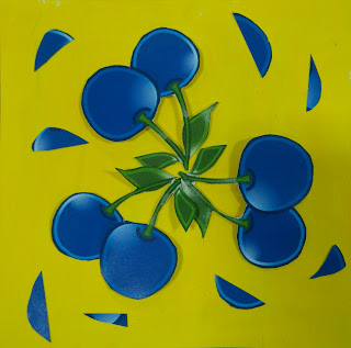
I started with an image then cropped the picture to improve it,  I then cropped that image again with focus only on the tree.  I then cropped each previous image to see what I could come up with.  I realised there was an interesting pattern developing so I added a few effects to alter the image.  What I like most is,  that if used out of context there would be no evidence that the pattern originated from a tree. 

Monday, 15 February 2016

Flooring idea-first model

I have decided to use underfloor lighting for my Tutti Frutti juice bar design.  Great idea!...  How do I do this? I managed to get hold of clear acrylic squares 100x100mm2, I then made the decision to make my design 400x300mm for the scale model.  I purchased some balsa wood to use for support and cut wooden blocks 40mm in length to use under the clear acrylic to make the flooring.  The reason for this,  was so that the lights could be thread underneath the acrylic with ease. Unfortunately when the balsa wood arrived in the post,  it was broken,  so I had to improvise with using a tomato ketchup portion to create the same height to construct more of my model- it sounds silly but it worked! During this stage, I spent a lot of time looking at composition and thinking about how I would connect each piece together in the best way for support and practicality.  I have decided on using 5 wooden blocks, evenly spaced along each 400mm length so that it leaves 4 spaces in-between for the different coloured lights to be passed through. These are some pictures of this design stage but I will be expanding on this,  now having received a new delivery of balsa wood...


Interior Tutti Frutti juice bar design - development

This past week I have been thinking a lot about my juice bar design. My three main starting points were -
1, My target audience is going to be 18-30yr olds,
2, I want to use bright vibrant colours,
3, use  drawings in the style of clip art images to add fun to my design.

My initial idea was to make each wall a different colour and design.  I decided to focus on strawberry ,  blueberry,  watermelon and lemon for my main fruits and have a red strawberry wall,  blue blueberry wall etc (see previous post).
The reason for this was, I had the idea of using glow sticks for tube lighting. I thought about positioning each glow stick above the wall of each corresponding colour to add emphasis to the theme. I also wanted to highlight a young, 'cool' environment which would appeal to a wider variety of people.
I spent a day or two trying out different colour and pattern designs,  using swirly 'juice like ' designs, but felt I was heading in the wrong direction.
I thought to myself,  'what is wrong with my design?  I then decided to leave my project for a day and realised that,  my idea's were fine, I just had to come up with a more appealing design.
What I noticed...
1, using only 4 fruits for my main design was a good choice, not too focused on one fruit and not to overwhelming.
2, The clip art design works well appealing to a younger age range
3, the 4 colours,  red,  blue,  yellow and green are a good range to work with.
4, using glow sticks for tube lighting would not work well, as the effect would not be long lasting,
5, the idea to make each wall a different colour made the design dark and heavy and too busy.
With this discovery, I realised what I needed to do to achieve the best design.  I decided to invest is some LED lights to use under a see-through floor. This means the flooring would be fun and bright,  therefore I could keep the rest of the interior walls and serving area light and mostly white.  The furniture would probably have colour within it to add effect but I am hoping that the lights from the flooring will reflect of the walls to create a subtle but effective result.

Friday, 5 February 2016

led lights and bubbles

I wanted to try one more idea using LED lights, before looking at another ways of creating effect with photography.  I thought that by using coloured LED lights while blowing bubbles would produce an interesting effect.  I began with covering my strip lights with clingfilm -so they were not damaged - then blew bubbles above the lights.  I used my Nikon camera for this and I was very disappointed with the outcome.  The photos did not seem to show any bubbles,  just an overpowering coloured light. I do feel my Nikon camera is great to use,  but as I have said in a previous blog,  it's Strong point does not involve using bright lights.  I then tried to take photos with my Sony Xperia smart phone,  this also produced a disappointing effect,  very similar to my Nikon camera. At this point I felt slightly confused as to why this didn't work,  was it the background colour?  Were the lights positioned correctly? Would I have been better trying this again in the daytime?  I wanted to try one last thing before packing up so I downloaded the 'timeshift burst'!app for my phone. Previously,  I have said that I would prefer to take my own photographs than  using any help or tricks to change the end result.  This time,  I decided to use the timeshift burst to give me a better chance of capturing a photo which would work. I felt with the fast falling bubbles,  it was better to try a different approach.  The photos I have came up with are not as I expected. In my mind, i had envisioned a perfectly round bubble with a variety of single colour tones throughout, this is not what I got.  Instead I have ended up with a combination  of vibration and movement. It isn't necessarily a bad thing,  in some ways it has produced an interesting result with possibilities for other ideas.  Here are some of my favourite pics...


Wednesday, 3 February 2016

Photography - Led lights and me

Recently I have been finding out about photography and photo editing.  I purchased my Nikon camera approximately 5 months ago and still have alot to learn about how best to use it.  So far,  I have found that I can take pictures with incredible detail from a long distance away,  and discovered that the quality of the photos are great the majority of the time. However,  I have noticed that I am unable to capture a good quality photograph when in certain conditions,  such as bright sunlight or while using LED lighting.  Now,  before I get too ahead of myself and blame it on the camera,  it is quite possible that it is my fault not using the correct settings.  I will need to explore this further.
I decided to expand the use of LED lights throughout my work and wondered how much of an effect,  lighting had on the appearance of a person or object. As I am still in my early stages of learning about photography,  I decided to try a few different techniques for a starting point and to use to compare my progress along the way.
The first idea I had,  was to take basic pictures of myself with different colored lighting.  The reason for this was to explore colour and tonal value.  I found it interesting to see how much the feel of an image can change by using different colours. I used my Nikon camera to take these pictures and was very disappointed with the outcome,  I am unable to upload any of these images at the moment,  but the colour of the LED light took over the majority of the photo.  My face had no definition with the over exaggerated colour and the images were very blurry.  Feeling slightly disheartened after setting everything up,i decided to try using my Sony Xperia smart phone.  Well,  what a difference! The camera captured the different light perfectly and as a starting point,  I feel there is enough information from the images to expand on to create interesting photos.
When comparing the images, it is easy to see how different lighting can change the appearance and feel of the image. Next I will try wearing a black or white vest with a plain background and see if there is difference with the result.


Tuesday, 2 February 2016

Tutti frutti pattern design

At present,  I am working on an interior design idea for my assignment.  The theme of this project is Tutti Frutti,  and the design idea is for a juice bar.  I have been very excited about trying an interior design idea,  when I discovered I was able to design a juice bar, I was full of ideas straight away.
I have recently completed 3 assessments,  but I have learned that I tend to produce a lot of ideas,  instead of spending more time expanding some of my better ones. This time I have already planned my project better and used one idea to expand instead of 3 or 4.
For the assessment I need to design the interior and exterior of a juice bar, using only the theme,  Tutti Frutti. This includes, designs for interior walls,  flooring, soft furnishings, seating,  structure,  lighting,  signage and the exterior.  I will need to think about imagery,  colours,  tonal value,  size,  materials and practicality. I will also be looking at lighting,  and repeat pattern through the process.
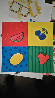
I have decided to start with the design for the interior walls.  I thought it would be interesting to have a different colour for each wall and choose 4 fruits to use as part of the main theme.  After using a different combination of colours, looking at composition and comparing texture and pattern of fruits.. I decided to use strawberry,  lemon, blueberry and watermelon. I used a mixture of acrylic paints and sharpie pens for the background colour,  with some clipart fruit sourced on Google for my example stage,  I will draw my own fruit for my final assessment.
 I am quite pleased with my decision on colour and tone, this is what I have came up with so far..