Tuesday, 3 May 2016

Photography- Final Images. Until the End


After spending a lot of time thinking about what to do, I finally came up with a 3 part story which I have named, 'Until the End'.  I have used 3 sheets of Mountboard to present my work and 72 5x5in photographs. I knew that when I was given the theme I wanted to be creative and come up with an alter ego effect , using colour to enhance mood and emotion. I felt that by documenting how I felt when I was going through a rough time, it helped me to go to the extreme lengths through my photography to come up with interesting images. At my lowest point I felt like I was plummeting deep into a downward spiral of depression and anxiety . I decided to use my experience to create a vision of my journey. Each A1 mounted selection of photographs has its own section of a story and it reads left - right.
My first series of images is trying to find out who I am. Once I started to fall into a black hole of confusion, I didn't recognize the person reflected in the mirror. I could not understand why that wasn't my reflection and why it didn't look like me. I  then decided to take photos of myself to reassure myself that I am, me. Once looking at the images, I recognized some of them to be me, but there was still this blurry vision of someone else. I arranged the photos starting with the ones where I recognized myself then added in the images that I couldn't relate to, this was difficult to do as I was in every photograph. By the end of this section I was feeling smothered and couldn't breathe, so I added an image to suggest that feeling.

 
By the time I arranged my second series of images , I was aiming to display a heightened sense of anxiety and feeling trapped so I edited the images using the 'lomo' filter on my smartphone. The images in this section represent a deeper sense of depression, I purposely made the images darker than the first series to add effect to a deeper, darker mood. The first image consists of the hands, of the people in my family, they are positioned in a circle to provide the feeling of strangulation. I will say at this point that I love my family, more than anything ,but when I felt as though I couldn't breathe, I felt suffocated by everything and everyone. Included within this series of images are stones from the front of my house, this is to represent feeling trapped and unable to leave the house. The shoe is the first air freshener I bought for my car, which may seem odd, but it is there to symbolize the aggression and confusion I have felt while driving, the image has a dark range of colours throughout to enhance the deep emotion felt. The final image in this series, is of a timer I have in the house. I have always felt that a timer is quite intimidating as it is putting pressure on a situation , when it runs out, its gone. I used this to provide the sense of running out of time.


For my third series of images , I used the 'lomo' editing filter twice on each image to add a further sense of darkness and despair. The images are not as clear due to the overpowering colours which I am very pleased with. The first image is again, the hands of my family but closer together to give a sense of added pressure and deeper suffocation, The second image is representing the feeling of drowning and feeling helpless. One of my favourite images in this series has to be the mirror reflection, which Is on the second last row. The feeling of anger and anxiety had built up rapidly at this point and the confusion had increased also. The reflection in the mirror appeared to be angry but I didn't understand how that was my reflection, did I really look like that? in the last stage everything was out of control, I couldn't understand what had happened or where to go. I had no idea how to fix things so I just lay down to rest.... until the end.


Photography Final Images- decision

After a lengthy process filled with experimentation and use of editing software, I have finally came up with my final images.  I wanted to create an impact on my photos, so my first idea included an individual frame of images around each photograph. For the frames, I took pictures of my eyes to emphasize the feeling of being watched, I took distorted pictures of a clock to give the feeling of out of no control, I also added chains to represent feeling trapped and a timer to provide the idea of running out of time. However , this did not work well in creating a good effect to my photographs, in-fact it added a negative, messiness to them, so I decided to use what I already had made and group each selection of items together, then take a photo of them instead. I still wanted to include them in my design so I made them into photographs too.
During the editing process, I used an over exposure editing tool to add a disappearing, faded effect to the images, I quite liked this but it was too strong to use on the amount of photos I had. I also tried changing the images into black and white, again I liked this idea but I felt that it lacked appeal- I wanted to grab the attention of people and make them spend time with my work. I then came across an editing filter on my smartphone named 'lomo'. this gave the images a deep saturation as well as a slight over exposure to them- this was perfect. I decided to alter all the images with this 'lomo' filter and they turned out really well.


Initially, I decided on having 8 photos sized A4,  to provide an alternate vision of My world, My view. That soon changed as I realized I had a lot more images to develop and  present, so I decided  to use photos sized 5x5in. I soon realized that I was standing with 150 5x5inch photographs to use for my final. This was good though ,as it gave me plenty of availability to pick the better photo and discard of those which had no effect on mood.

Photography thoughts and process - social media influence

When given the theme - My world, My view, I was instantly inspired to take this opportunity to push the limits and come up with something wild . I started to think; What is my world? What is my view on the world? How do I view others? Who am I?
I started to think about people within my world, but who? My personal life has a great divide , in which, I have my genuine friends that I can call or text, or I have my social media friends that I don't necessary speak to. I began to feel confused about who is real and what is real.
Social media has had a great impact on how people communicate and become 'friends' with one another. I also realized that social media is extremely fake, take Facebook for example, it is one of the most popular social media sites circulating  at present. There are people I know, who upload pictures of themselves having a great time, partying, spending time with family, etc. The reality is, they only upload pictures when they eventually do something interesting. It is as if they have to prove to their 'friends' that they are having a great life, when the truth is they are miserable and boring people to be around! I could continue to rant about social media vs. reality all day given the opportunity, but this gave me an  idea on what I could do for my final photography. I thought it would be interesting to use the idea of social media vs. reality to show an alternate side of me. Revealing a negative, weak side compared to my positive, strong personality.
My view of myself- I like to think of myself as a positive , enthusiastic, caring  and reliable. I am a good friend and will help anyone in need. Recently, that was not  the case, I had lost myself for a while and no longer recognized the person looking back in the mirror. Aggression, depression, anxiety, mood swings and attitude. This was very out of character and I could not help my emotions or behaviours, It started to escalate out of control rapidly.
My world, my view- I decided to take this opportunity of using my photography to create a series of images to show an alternate me. I am an easy going, social person but I was not inspired to just take photos of myself in different situations. All my friends know that I am a family person, I am a student, a worker and a mum, but that's not new or exciting enough to mount photos off-I have a million photos of me at home! It was time to be adventurous and  go crazy.
The first step I took was writing down all the positive characteristics of myself, I then added any other positive things in my life, everything from family to socializing. I then made another list of the opposite of what I had already written down such as, family - alone, socializing with friends - drinking alone, ecstatic - miserable, and so on. My initial thought was , am I able to do this? as it is extremely out of character and my comfort zone. After reflecting on my idea and plan, I decided to continue with it and take full advantage of this opportunity.

Monday, 2 May 2016

Tool Aid repeat pattern

Recently we have been looking at a variety of different tools to help us with our design work. We have used a variety of media to draw and paint different tools.
Last week I tried print making to see what effects I could create with this different technique.  Initially I started using a felt pen to draw tools but felt that the lines I made weren't sharp enough.  I then tried pencil and I was very pleased with the result.  I started to draw a few different tools to see if print making provided a better effect with one tool better than another. I felt that the pencil worked well with each drawing and I was also able to add pressure to make darker,  stronger lines- I was not able to do this with a pen.
I then began to wonder how I could expand on my drawings and incorporate them into a design idea.  I photocopied the drawings that I done then reduced the size of the images,  making several copies of each size. I then cut out some of the pictures then placed them infront of coloured backgrounds.  First I used orange acetate infront of the image then repeated the process with an additional image,  then a third.  This worked okay but I thought I would try different coloured backgrounds.  I used red,  yellow and blue backgrounds individually against the tool then placed them side by side and copied the image.  I once again repeated the pattern then shrunk the image down. I was very pleased with this result,  there are so many uses for this idea.  I also tried the same idea with another tool using green,  yellow and blue against black.  I feel I have achieved a lot throughout this process and I'm excited about making more.


Tuesday, 19 April 2016

Tool Aid - preparation for assessment

At college  we have been focusing on a new unit with the theme,  "Tool Aid". In preparation for this unit, we have been looking at a variety of different tools. Our main focus has been on gardening and Diy tools. We are also able to expand by thinking about other types of tools,  such as: machinery,  kitchen utensils or stationary.
Over the last couple of days,  I have been drawing a selection of tools from life, using a variety of media to see what works well through tonal value and detail. I have used Indian ink, charcoal,  pencil,  pen, charcoal pencils and watercolour pencils throughout this design process.  So far, I feel that the Indian ink had the best overall effect,  I liked the way there was a natural flow when creating lines, and by adding water, the ink could be manipulated into a watered-down effect . I also discovered that it was quick and easy to use.  My least favourite media was the watercolour pencils,  I felt that the colours were not strong enough to to make the object feel solid and heavy aswell as the tonal value not being as good as it could be.
I have enjoyed this process, I now have a better understanding of why artists use a certain type of media to express and replicate an object from still-life observation.


Wednesday, 13 April 2016

#dak01 Art Exhibition


A few days ago I went to an Art Exhibition  in Jedburgh, in the Scottish Borders.  It was a 3 day exhibition where a small group of Artists gathered to express their view through their work on a large scale.
The first Artist I met Was James Wyness, he used music,  noise and sound in space for his inspiration. I was able to witness his work in action as he played various sounds through a speaker. His investigation was to see the behaviour of amplified and acoustic sound and music in a large air space to see if there were variations through interventions.  The sounds were mainly high pitched,  single notes combined together to make 'noise', there was no rhythm or music flow. Although this was an interesting art form,  I didn't really take to it but it may be more appealing to others.

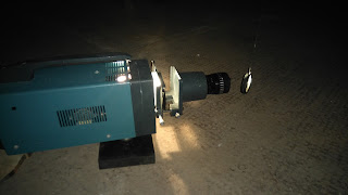
 I also saw the work of Graham Patterson, unfortunately I did not get to meet him but his work instantly grabbed my attention.  The main thought for Graham's work was to recreate the the movement of water and patterns from the sea.  For one of his art pieces,  he had a bowl of water taken from the sea (spittal,  I think) sitting infront of a fan heater and projector.  The heater was situated at the side of the bowl and positioned so that the air was directed onto the water. The room was dark, so that the light from the projector could reflect the wave-like patterns onto the wall. The pattern was constantly moving,  resembling a steady gentle wave. This was very inspiring as I was thinking about using a water /wave idea for my photography unit at college.  The other art piece he had, was using light reflected through a smooth circular piece of glass onto the wall to create a different pattern.  The glass was attached in front of the light, from the ceiling and was free to move as it wanted. This effect produced a variety of circular patterns on another wall in darkness .  They made me think about sunlight glisten on a gentle sea on a beautiful day.  I really enjoyed his work and would be interesting in seeing more.


 Then there was an Artist Felicity Bristow who had a very different style from the others. She used old materials and objects found within the building - previously a bakery,  but had been empty for a long time - and used them to create her vision. There were objects such as an old door mat and oven tray used as part of her work,  these were suspended from the ceiling with paper attached , dropping down into a liquid substance on the floor in another tray. I would imagine that the paper was a form of parchment paper but I am unsure,  and the liquid looked as if there was ink or dye within it. I thought this idea was a great use of materials and I liked the patterns made by the liquid moving up the paper, there was a few different colours which made it appealing to look at. Another piece she had done, was using coloured thread attached at various points across the stretch of a wall, I must admit,  this wasn't my favourite work but it was interesting to look at and could be interpreted in many different ways.


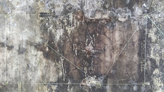
 The final Artist that was there was Niall Campbell, who is a lecturer at Borders College. The idea behind Niall's work was Hidden history and hidden meanings.  To create his vision,  he used a series of etchings and pattern designs which he made himself and printed these onto a large wall space within the building.  There was a variety of different designs used throughout his art work but he was presenting his work as one large piece. The purpose of his art was to show a hidden meaning of depth and layers.  By using a layered effect on the wall through his print making, Niall  was able to create an interesting idea of how an image is not necessary what it first appears.  At first when I looked at the wall I could see various patterns,  repeated and repositioned.  The patterns on the wall looked like there had been wallpaper or a painted design beneath the crumbled,  uneven surface layer, this was exactly as it was meant to look. Niall explained that seeing something as it is, does not mean that you are seeing the true self. That there are hidden layers and messages that not everyone can see. As people,  we all have our individual characteristics which are on the surface, but does anyone see what lies beneath?  He wanted to make people think about internal space,  both physical and mental. This was a very inspirational piece which I was able to relate to.  Currently,  I am working on a photography portfolio where I am creating a visual image of depth within myself, focusing on the side of me that people dont see. I want to produce images  showing what lies beneath the surface and present my photographs effectively to enhance the emotion.  I felt that by going to the exhibition I was able to experience work with a similar idea, which gave me the extra confidence in what I was doing. The longer I spent admiring Niall's work, the more I was able to understand and connect with the message he was expressing.


 Overall I am very pleased I went to this exhibition. It was inspiring to see how differently people express themselves through their art. Each artwork was different and I was able to relate to some art more than others,  which in itself is good for my own self awareness, and helping me discover my own path through expression and vision.  I would definitely recommend going if another exhibition is held.  I left with a completely different view of how to express art and inspired to try different techniques and effects.

Friday, 8 April 2016

David Hockney Photographer and Artist

I was looking for a photographer who I could use for inspiration for my photography unit.  I came across the work of Photographer David Hockney, I was instantly drawn to his photo collages, I liked the style he used and effect he was able to create.
When I started to research Hockney, I found that he didn't just do photography, but he also painted and sketched drawings as well as stage design work and graphic design.  As I started to look through his work, I noticed that he didn't seem to have a specific style and it was interesting to see the variety of work that he produced. There was a large variety of work, from photo collages to design inspired paintings.  He also used a variety of media throughout his work, some of what he used, was acrylic paint, oil paint, water colours, charcoal and even crayons and pen.
I found my information on http://www.hockneypictures.com
The webpage itself was very well set up, it was easy to access and all Hockneys work was in order of when it was done, this gave me a better idea about the different stages of his art and vision. From the beginning to present, it is clear to see that Hockney has captured people and places throughout the years in their natural setting, almost presenting a visual diary of how things have changed over the last 50 odd years. In doing this , it has made me realise that he is not painting and drawing anything that interests him but is making recordings of the world through his vision.
I was very keen to learn more about this Artist and Photographer so I continued to find some background information.  I discovered that David Hockney was born on 9th July 1937.  In 1959 he started studying at the Royal College of Art, London. In 1961 he wins Junior Section Prize in the John Moore's painting exhibition in Liverpool. Later on, in 1967 he returns to the Walker Art Museum in Liverpool to walk away with first prize for his painting, "Peter getting out of Nick's pool." From then on, Hockney has expressed himself throughout his art with Picasso as his main inspiration.  He uses a variety of different techniques and processes and I am fascinated with the work he has done. I had selected a few images which I have found interesting and inspiring, each for a different reason. These include, "timber gone", 2008 charcoal on paper, "Margaret and Ken, Bridlington" 2002, ink on paper, "Skeleton", 1959, Charcoal, "what about the caves" 1991, oil and many more. Unfortunately, when I logged back onto the webpage , I was presented with this...

                                " STOP
       This site and contents are copyright David Hokney
and may not be reproduced anywhere at anytime in any form."
 

so I figured I would be better to delete all my pictures just to be safe....... such a shame.