Thursday 5 May 2016

Tool Aid repeat pattern - acetate

For one of my units I have been asked to look at tools for inspiration for a design.  Tools can include anything from garden and handheld tools to machinery.
I recently tried a repeat pattern design with a spanner on coloured backgrounds.  I quite enjoy pattern design,  so I wondered how else I could come up with another design.
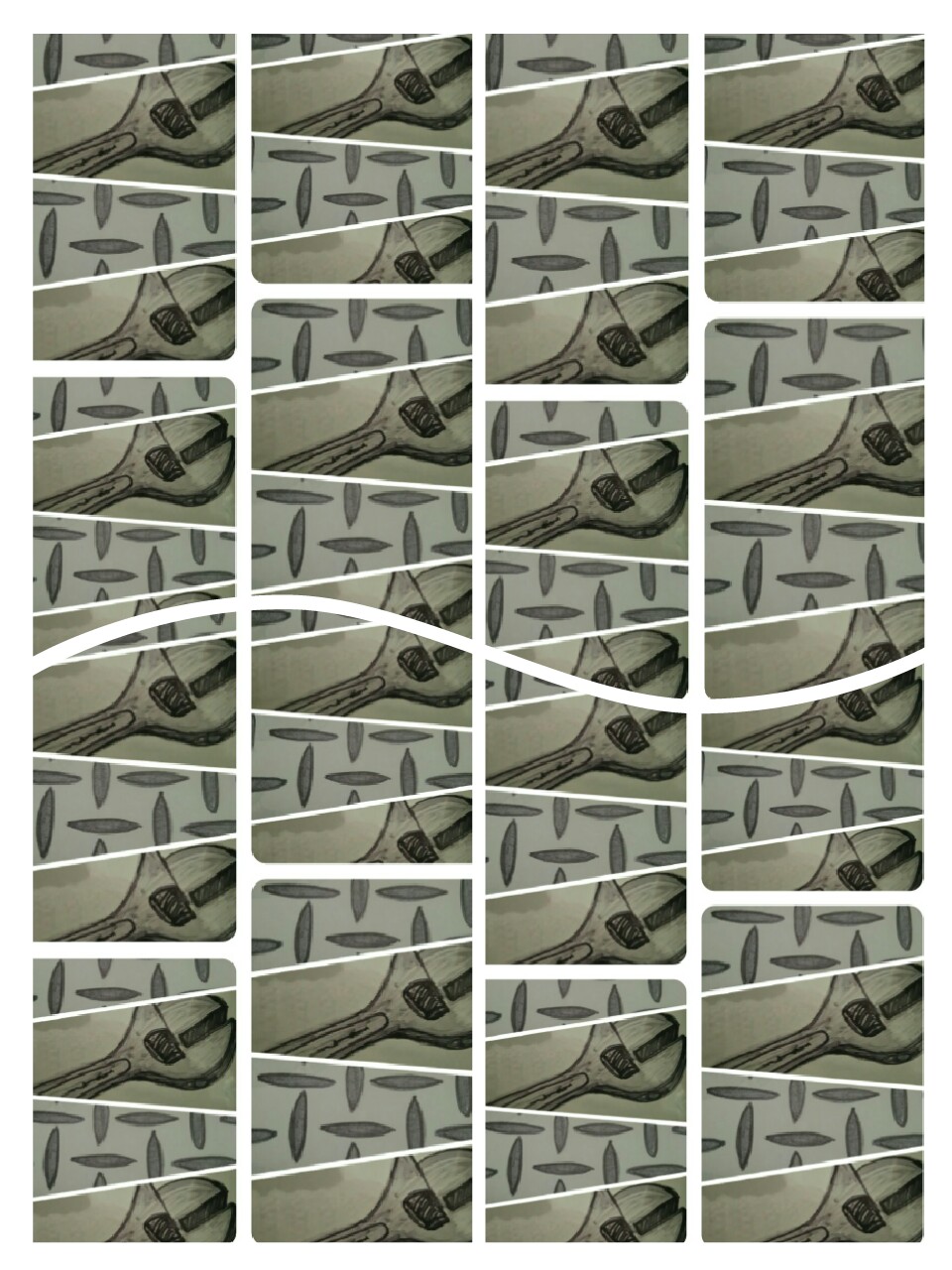
I started with an a4 piece of acetate and cut it into 3 sections.  On the first piece,  I used a grey sharpie pen to draw a spanner.  On the second sheet,  I lay it on top of the drawing I just done,  then drew the shading to add a more 3 dimensional look. After removing that second sheet I placed my 3rd sheet on top of the first drawing,  then added the detail with a black sharpie.  I placed the images in order on top of one another to see if I was able to achieve an interesting result.  The idea was good but there was no depth to the image. I then took a separate piece of paper and drew a pattern which I saw on some packaging in a hardware store. After placing my 3 collected drawings on top of this, i hoped that it would add to a 3dimentional look. Unfortunately, due to the lightness of the pen, the background was visible through to the surface.
I felt that there must be something else I could do to achieve a better result, so after taking photographs on my phone,  I edited them with a filter.  This effect worked to a point but I still felt there was more I could do. I started experimenting with the collage option on my phone which created some interesting results,  I then took the collages I made then repeated the process again,  and again.  I feel that I have achieved an effective repeat pattern design digitally.  My next step would be to print of  a few  of the pattern designs and repeat them side by side. This could potentially be used to design a wallpaper,  clothing or a soft furnishing such as cushion covers or curtains.  I am very pleased with the outcome of this experiment.


Phillipe Halsman photography influence

I have been thinking about what photographer's inspire me throughout my work. I came across the work of phillipe Halsman. I discovered that he began his photography in Paris.  In 1934 he opened a studio in Montparnasse where he photographed well-known artist's and writers. Some of these people were Andre Malroux,  Le Corbusier and Marc Chagall.
In 1940 Halsman and his family moved to the United States,  where he started a working relationship with Salvador Dali which would last for the next 37 years.
From 1941 an unusual style of photography developed between them, which resulted in such works,  'Dali Atomicus' and 'Dali's moustache' series.
From 1950 Halsman started to ask his clients to jump at the end of each section so that he could capture this moment with his camera,  these images became a very important part of his photography career. "every face I see seems to hide- and sometimes fleetingly to reveal -the mystery of another human being.  Capturing the revelation became the goal and passion of my life".  Halsman was interested in the expression and individual appearance of  people's faces. He carefully enhanced the feeling of emotion throughout his photography,  wether it was mysterious,  excited or joyful, the action in the image matched the facial expressions of the people in the photos.
Throughout his career,  Halsman obtained a vast amount of awards.  His photographs also made it on 101 covers of life magazine,  which was more than any other photographer had ever done. In 1945 he was also elected the first president of the American Society magazine.
Out of all the photography a few of my favourite works are:
His 'jumps' collection,
His work with artists and
The 'dance' series.
This is one of my favourite photos,  I could look at this image all day. what I like most is that, Halsman has been able to capture an unusual moment in time through composition and movement.  The lighting also adds to the direction of the photo with the top right Corner being dark. A very rare piece.

Another piece I find interesting, is the women positioned to create a skull. The composition of the women works brilliant in directing the eye around the figures.  The only query I have is wether the woman on the left should have her leg bent inwards.  I cant decide if this is deliberate,  as it takes away the symmetry from the rest of the formation.
An image from Dali's moustache collection,  this image appears to be simple but it made me wonder if Dali was positioned upside down at the time of this photo.   There seems to be a tension in his face,  not a negative expression, but it made me wonder if he was either upside down or holding his breathe at the time this was taken.  It could be that once developed,  the image was rotated to make it appear as if he was upright. I also like the perfect position of the moustache directed through the centre of his eyes.
This image has an interesting illusion effect about it, I also like how the numbers are in the wrong order.
This is an image from the dance collection,  at first glance I wondered how this image was taken,  the person appears to be in flight.  I then noticed the position of the plane. I realised that this photo would have been taken from the ground looking up, making it appear that the man was flying through the sky. It provides a very good effect and works well. This is a good example of how camera angle can alter the result of a photograph.

Wednesday 4 May 2016

William Henry Fox Talbot - historic photography


For my photography unit I was instructed
to find 2 historic photography influences.  I decided to look at the work of William Henry Fox Talbot, he was known as the father of photography so I was interested to discover more about his type of work.
I found out that, as well as known for his photography,  he was also an eminent mathematician,  astronomer and archaeologist.  He also invented salted paper and calotype processes.
In 1839, Talbot reported his, 'art of photogenic drawing ' to the Royal Society.  After experimenting with development processes,  he discovered that,  if he made prints on light sensitive paper,  they produced a positive result.  He went on to experiment with exposure time and accidentally discovered that a print does not need as much exposure time as he first thought.  He realised that if he added a chemical to the 'negative' image,  the image was able to be viewed in the light,  without fading.  He then expanded on that idea by repeating the process on other negative prints,  he called this process calotype.
In 1842, he was presented with a medal from the Royal Society for all his hard work.
I sourced some images online which were taken by Talbot,  what makes the images extra special is the originality of them and that these are, and will always be an incredible part of our history.
Window in the South Gallery of Lacock Abby.
This first image is known as the oldest photographic negative in existence.

London Street. reading East side, c. 1845

miss Horatia Feilding, half sister of W.H.F Talbot 

Andy warhol influence

For my photography unit I looked at a variety of photographers for ideas on how to express emotion through my work.  I already knew Andy Warhol produced alot of self portraits so I revisited his work, looking for inspiration. His self portraits inspired me instantly.  What I like most about his work is the way that his self portraits speak a thousand words. There is also a strong connection between all his self portraits, which is that he has a negative expression. Wether his expression is miserable , confused or tense,  they all share the same theme. I also like that in some instances, he repeats an image to add emphasis to his work. In other cases, he has printed an image and used a variety of media to to add colour to his photographs,  such as acrylic and/or silkscreen.  I find Warhol's work to have a mystery to it,  out of all his work,  I find the self portraits the most interesting and inspiring.  A few of my favourite artworks include:
Self portrait - strangulation 1978,
Self portrait in interview t-shirt 1977-8 and
Self portrait 1976-86
Each self portrait is very different but shows a different emotion and style for each.


Tuesday 3 May 2016

Photography- Final Images. Until the End


After spending a lot of time thinking about what to do, I finally came up with a 3 part story which I have named, 'Until the End'.  I have used 3 sheets of Mountboard to present my work and 72 5x5in photographs. I knew that when I was given the theme I wanted to be creative and come up with an alter ego effect , using colour to enhance mood and emotion. I felt that by documenting how I felt when I was going through a rough time, it helped me to go to the extreme lengths through my photography to come up with interesting images. At my lowest point I felt like I was plummeting deep into a downward spiral of depression and anxiety . I decided to use my experience to create a vision of my journey. Each A1 mounted selection of photographs has its own section of a story and it reads left - right.
My first series of images is trying to find out who I am. Once I started to fall into a black hole of confusion, I didn't recognize the person reflected in the mirror. I could not understand why that wasn't my reflection and why it didn't look like me. I  then decided to take photos of myself to reassure myself that I am, me. Once looking at the images, I recognized some of them to be me, but there was still this blurry vision of someone else. I arranged the photos starting with the ones where I recognized myself then added in the images that I couldn't relate to, this was difficult to do as I was in every photograph. By the end of this section I was feeling smothered and couldn't breathe, so I added an image to suggest that feeling.

 
By the time I arranged my second series of images , I was aiming to display a heightened sense of anxiety and feeling trapped so I edited the images using the 'lomo' filter on my smartphone. The images in this section represent a deeper sense of depression, I purposely made the images darker than the first series to add effect to a deeper, darker mood. The first image consists of the hands, of the people in my family, they are positioned in a circle to provide the feeling of strangulation. I will say at this point that I love my family, more than anything ,but when I felt as though I couldn't breathe, I felt suffocated by everything and everyone. Included within this series of images are stones from the front of my house, this is to represent feeling trapped and unable to leave the house. The shoe is the first air freshener I bought for my car, which may seem odd, but it is there to symbolize the aggression and confusion I have felt while driving, the image has a dark range of colours throughout to enhance the deep emotion felt. The final image in this series, is of a timer I have in the house. I have always felt that a timer is quite intimidating as it is putting pressure on a situation , when it runs out, its gone. I used this to provide the sense of running out of time.


For my third series of images , I used the 'lomo' editing filter twice on each image to add a further sense of darkness and despair. The images are not as clear due to the overpowering colours which I am very pleased with. The first image is again, the hands of my family but closer together to give a sense of added pressure and deeper suffocation, The second image is representing the feeling of drowning and feeling helpless. One of my favourite images in this series has to be the mirror reflection, which Is on the second last row. The feeling of anger and anxiety had built up rapidly at this point and the confusion had increased also. The reflection in the mirror appeared to be angry but I didn't understand how that was my reflection, did I really look like that? in the last stage everything was out of control, I couldn't understand what had happened or where to go. I had no idea how to fix things so I just lay down to rest.... until the end.


Photography Final Images- decision

After a lengthy process filled with experimentation and use of editing software, I have finally came up with my final images.  I wanted to create an impact on my photos, so my first idea included an individual frame of images around each photograph. For the frames, I took pictures of my eyes to emphasize the feeling of being watched, I took distorted pictures of a clock to give the feeling of out of no control, I also added chains to represent feeling trapped and a timer to provide the idea of running out of time. However , this did not work well in creating a good effect to my photographs, in-fact it added a negative, messiness to them, so I decided to use what I already had made and group each selection of items together, then take a photo of them instead. I still wanted to include them in my design so I made them into photographs too.
During the editing process, I used an over exposure editing tool to add a disappearing, faded effect to the images, I quite liked this but it was too strong to use on the amount of photos I had. I also tried changing the images into black and white, again I liked this idea but I felt that it lacked appeal- I wanted to grab the attention of people and make them spend time with my work. I then came across an editing filter on my smartphone named 'lomo'. this gave the images a deep saturation as well as a slight over exposure to them- this was perfect. I decided to alter all the images with this 'lomo' filter and they turned out really well.


Initially, I decided on having 8 photos sized A4,  to provide an alternate vision of My world, My view. That soon changed as I realized I had a lot more images to develop and  present, so I decided  to use photos sized 5x5in. I soon realized that I was standing with 150 5x5inch photographs to use for my final. This was good though ,as it gave me plenty of availability to pick the better photo and discard of those which had no effect on mood.

Photography thoughts and process - social media influence

When given the theme - My world, My view, I was instantly inspired to take this opportunity to push the limits and come up with something wild . I started to think; What is my world? What is my view on the world? How do I view others? Who am I?
I started to think about people within my world, but who? My personal life has a great divide , in which, I have my genuine friends that I can call or text, or I have my social media friends that I don't necessary speak to. I began to feel confused about who is real and what is real.
Social media has had a great impact on how people communicate and become 'friends' with one another. I also realized that social media is extremely fake, take Facebook for example, it is one of the most popular social media sites circulating  at present. There are people I know, who upload pictures of themselves having a great time, partying, spending time with family, etc. The reality is, they only upload pictures when they eventually do something interesting. It is as if they have to prove to their 'friends' that they are having a great life, when the truth is they are miserable and boring people to be around! I could continue to rant about social media vs. reality all day given the opportunity, but this gave me an  idea on what I could do for my final photography. I thought it would be interesting to use the idea of social media vs. reality to show an alternate side of me. Revealing a negative, weak side compared to my positive, strong personality.
My view of myself- I like to think of myself as a positive , enthusiastic, caring  and reliable. I am a good friend and will help anyone in need. Recently, that was not  the case, I had lost myself for a while and no longer recognized the person looking back in the mirror. Aggression, depression, anxiety, mood swings and attitude. This was very out of character and I could not help my emotions or behaviours, It started to escalate out of control rapidly.
My world, my view- I decided to take this opportunity of using my photography to create a series of images to show an alternate me. I am an easy going, social person but I was not inspired to just take photos of myself in different situations. All my friends know that I am a family person, I am a student, a worker and a mum, but that's not new or exciting enough to mount photos off-I have a million photos of me at home! It was time to be adventurous and  go crazy.
The first step I took was writing down all the positive characteristics of myself, I then added any other positive things in my life, everything from family to socializing. I then made another list of the opposite of what I had already written down such as, family - alone, socializing with friends - drinking alone, ecstatic - miserable, and so on. My initial thought was , am I able to do this? as it is extremely out of character and my comfort zone. After reflecting on my idea and plan, I decided to continue with it and take full advantage of this opportunity.

Monday 2 May 2016

Tool Aid repeat pattern

Recently we have been looking at a variety of different tools to help us with our design work. We have used a variety of media to draw and paint different tools.
Last week I tried print making to see what effects I could create with this different technique.  Initially I started using a felt pen to draw tools but felt that the lines I made weren't sharp enough.  I then tried pencil and I was very pleased with the result.  I started to draw a few different tools to see if print making provided a better effect with one tool better than another. I felt that the pencil worked well with each drawing and I was also able to add pressure to make darker,  stronger lines- I was not able to do this with a pen.
I then began to wonder how I could expand on my drawings and incorporate them into a design idea.  I photocopied the drawings that I done then reduced the size of the images,  making several copies of each size. I then cut out some of the pictures then placed them infront of coloured backgrounds.  First I used orange acetate infront of the image then repeated the process with an additional image,  then a third.  This worked okay but I thought I would try different coloured backgrounds.  I used red,  yellow and blue backgrounds individually against the tool then placed them side by side and copied the image.  I once again repeated the pattern then shrunk the image down. I was very pleased with this result,  there are so many uses for this idea.  I also tried the same idea with another tool using green,  yellow and blue against black.  I feel I have achieved a lot throughout this process and I'm excited about making more.