Wednesday, 2 March 2016

Juice bar - interior design ideas

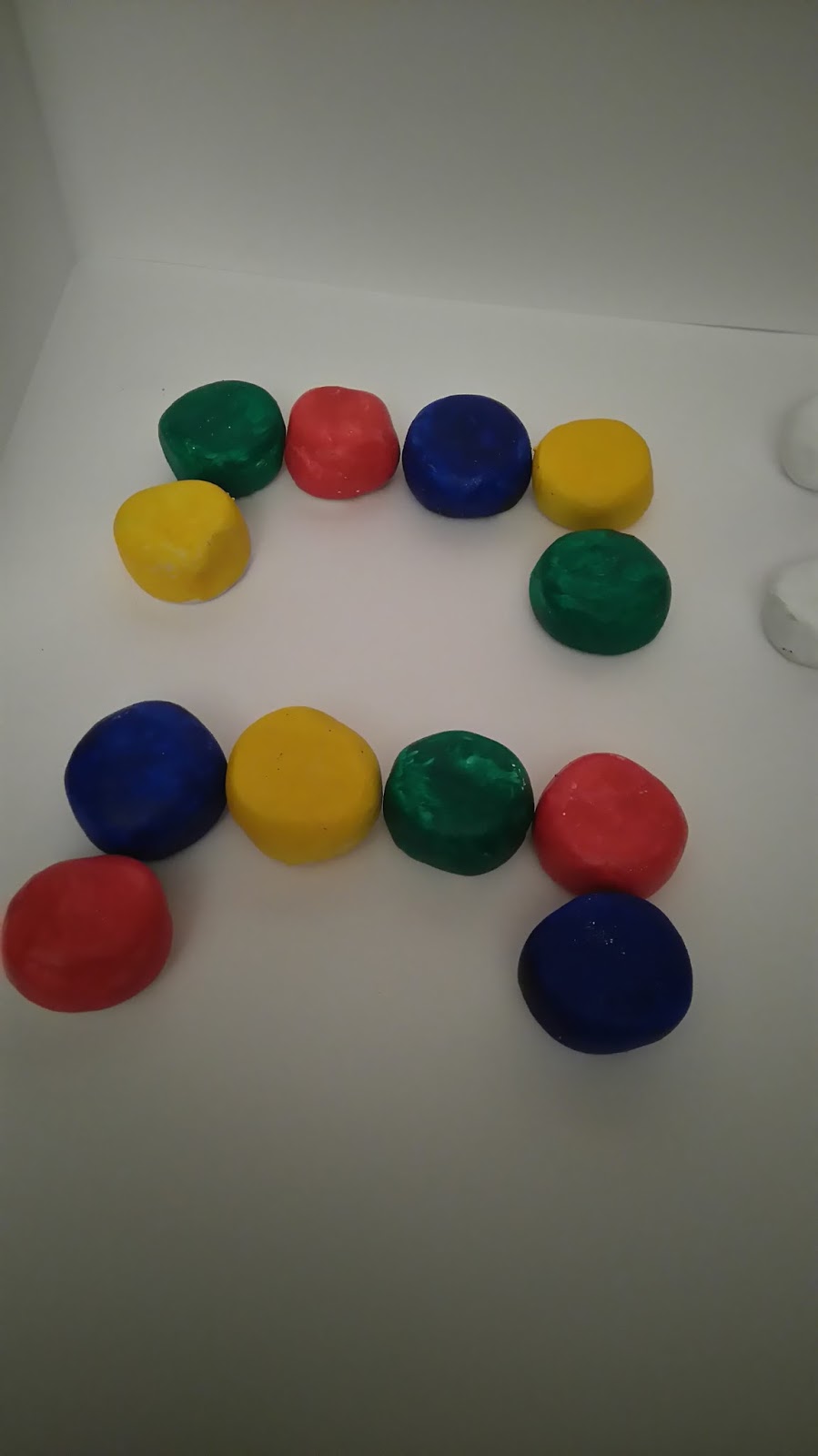
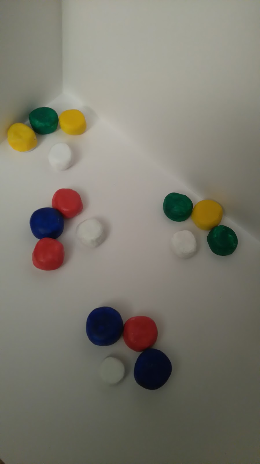
For the interior walls for my juice bar,  I have been thinking about the best way to use my fruit colours red,  blue,  green and yellow.  As my flooring will be quite bright, I will need to keep the walls quite bright and light. I have tried a few different options to see what looks best.


I like the bright colours in this one but i think the colours are too dark.


 I think the swirl patterns work well- there is a good amount of colour and still a lot of white to reflect the flooring lights.


I feel the plain walls in this design are too plain,  maybe adding a mirror on them or a pattern would work,  but I probably won't use this option. 


This is my favourite option so far,  I wanted to use an uneven pattern so it is more fun than serious.  I also tried to create texture of fruit by glueing sand to the card before painting over. Although this worked,  it feels like a fine sandpaper.

I will construct my flooring again and try these options again to give me a clearer idea of what would work best.

Friday, 26 February 2016

Juice bar design - flooring

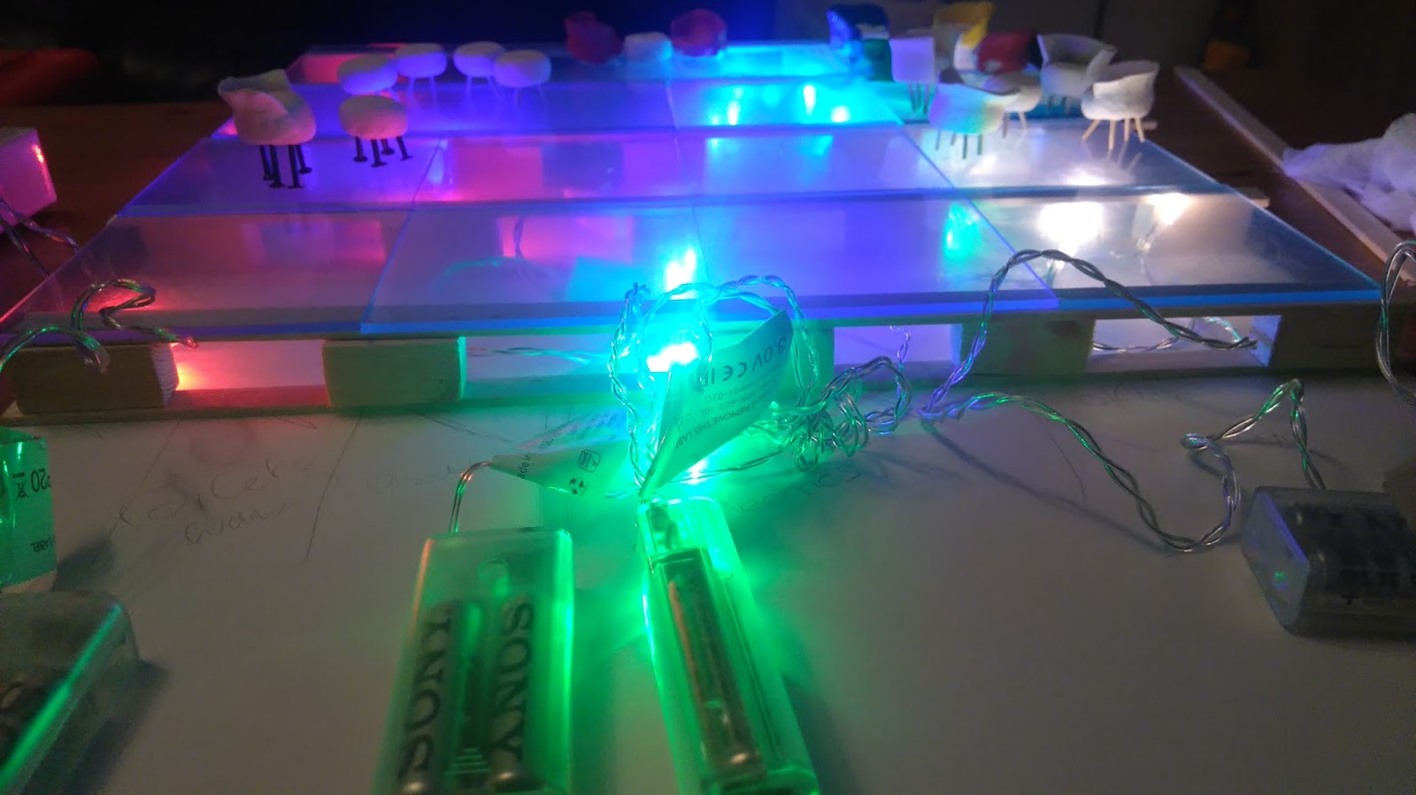
For the flooring for my juice bar I wanted to come up with a slightly different design compared to images I have sourced online.  The images of juice bars I have seen, contain similar colours, style and theme. While thinking about designing a juice bar,  I thought about who my target audience would be.  I decided it would be aimed mainly  at 18-30year olds and I would need to use bright, vibrant and fun colours . I wanted to use red, yellow,  green and blue for my colour scheme  to represent the colour of fruits. I sourced some battery operated lights in these colours and I will be using these for my main lighting.  The lights will be placed under clear acrylic tiles to create an interesting design.  After assembling my design,  I am extremely pleased and excited about what my finished product will look like.


Juice bar design - seating colour

I am keen to keep my design minimalistic with the same theme. I have decided to use four fruits and four colours within my design -strawberry,  lemon, watermelon and blueberry  with red, yellow,  green and blue to represent the colours of the four fruits. I used acrylic paint to paint on the clay seats with different styles so I had a variety of options to chose from. I also looked at composition of the furniture to see what would provide a functional layout.  After experimenting with this,  i have decided to have 2 sets of 4 seats and 2 sets of 2 seats. I will not be using the stools as part of the design as they do not have the same appeal as the tub chairs.


After completing this task,  I have made the decision to keep the furniture white.  I feel this would work best against the coloured floor. I am hoping  the colours from the floor would be reflected against the white furniture and produce an interesting effect. 
                  

Juice bar design - seating

I have been thinking about what style of tables and chairs I would like to use for my design. I first thought about making furniture in the shape of fruit such as watermelon,  lemon, strawberry and blueberry.  After using cardboard to construct the furniture,  I was not pleased with the quality. In the meantime,  I had set up the flooring to hopefully inspire me with the style of the furniture.  After looking at the lights with the flooring,  I decided to steer away from the shaped furniture as I felt it would be too busy and have no positive effect on the whole design.
I then tried using air drying clay to see what I could come up with.  I liked  using the clay because it was easy to work with and I could construct furniture in different styles and sizes with ease to see what would work best. I started by making tub chairs and stools with no feet,  I then used cocktail sticks , other wooden sticks and metal pins. The cocktail sticks looked really good but the metal pins did not add height to the seats so that did not work.  For my next design, I used some nails pushed up through the clay,  which worked better than the cocktail sticks and provided a more sturdy design. After comparison,  I am thinking of using the tables and chairs with the nails.


Wednesday, 24 February 2016

Photography using mirrors in the garden

After looking at objects around the home,  I wondered what else I could use as a reflection.  I decided to go outside and put the mirror on the concrete stairs.  I thought it would be interesting to use the pattern on the concrete so that the reflection would almost resemble a reflection of buildings on water.  I felt the image was good but didn't have any relevance to it.
I adjusted the mirror so that it was no longer against the step. This was a good decision as the night sky was reflected in the mirror.  I was very pleased with this result because, it almost looks like there is a hole in the step.
I tried the same idea by placing the mirror onto the grass.  I feel this worked but not as well as the step. Unfortunately I was unable to take a good image without using the flash at this time of night, so the reflection of the flash is visible on the mirror. In future,  I will use the same idea but when it is lighter outside. I like how the garden fence is also reflected in the mirror as it adds emphasis to depth and adding to the idea that there is a hole underground.


Photography - reflections with mirrors

For my photography project,  I was thinking about how I can use reflections to create interesting images using objects in my home. I used a mirror and positioned it effectively against items to find different view points and angles that would provide me with an interesting image. Once I took the picture,  I edited it by cropping it to add more emphasis on the object,  shutting out the background. This is what I came up with..


I found the images very interesting and feel this may be a good idea to advance on.

Wednesday, 17 February 2016

Overexposure - stairs

Where I stay, there is a set of stairs situated not far from the main streets.  These stairs have always had interesting stories and "nicknames" for how dangerous they are,  or about things that have happened around them.  Basically, they have quite an eerie feel to them. What I find most interesting,  is that the stairs dont serve a great purpose,  they lead up to a street of houses but there is also another way to the same place. However,  I have always found the quirkiness and unevenness of the stairs themselves to be quite interesting.  I also like the tunnel shape surrounding the stairs. I wanted to create a series of images that would add character and colour to the feel of the image. I actually found this more difficult than I first thought.  I thought mainly about composition but the stairs were so uneven that it was more difficult to capture the correct angle. I then tried using an over exposed filter on one of the images then cropped it slightly.  I feel this has produced a brighter,  sharper and, more pleasing image.  This is what I came up with